
Performance Creative Case Study: Retail Paid Ads
2026
Role
Creative Strategy
Design
Core Creative Team
Raneq Barber (Copy)
For Sprout Social’s retail campaign, I partnered with copy to test how different creative narratives and visual approaches affected paid performance. Rather than treating the ads as a single campaign system, we developed four distinct ad sets around different hypotheses: straightforward versus unexpected, product-led versus value-led, and photography versus graphic-driven creative.
The goal was to see whether more intentional storytelling, grounded in Sprout’s brand tenets, could improve engagement while helping us understand which creative approaches resonated most strongly with retail audiences.
Key results:
Best-performing set: up to +497% more clicks than expected
Three of four ad sets: outperformed expected click benchmarks
Lowest-performing set: 56–59% below expected, helping identify which creative direction was least effective
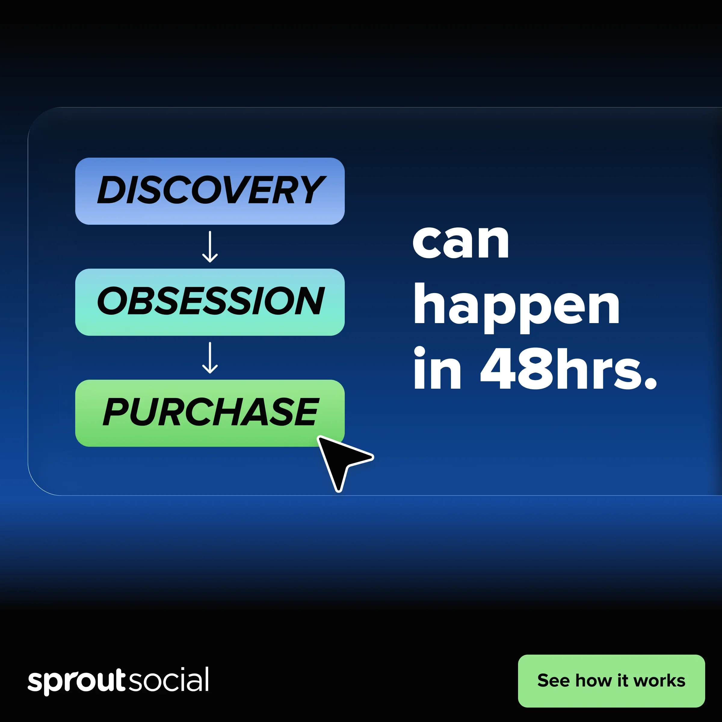
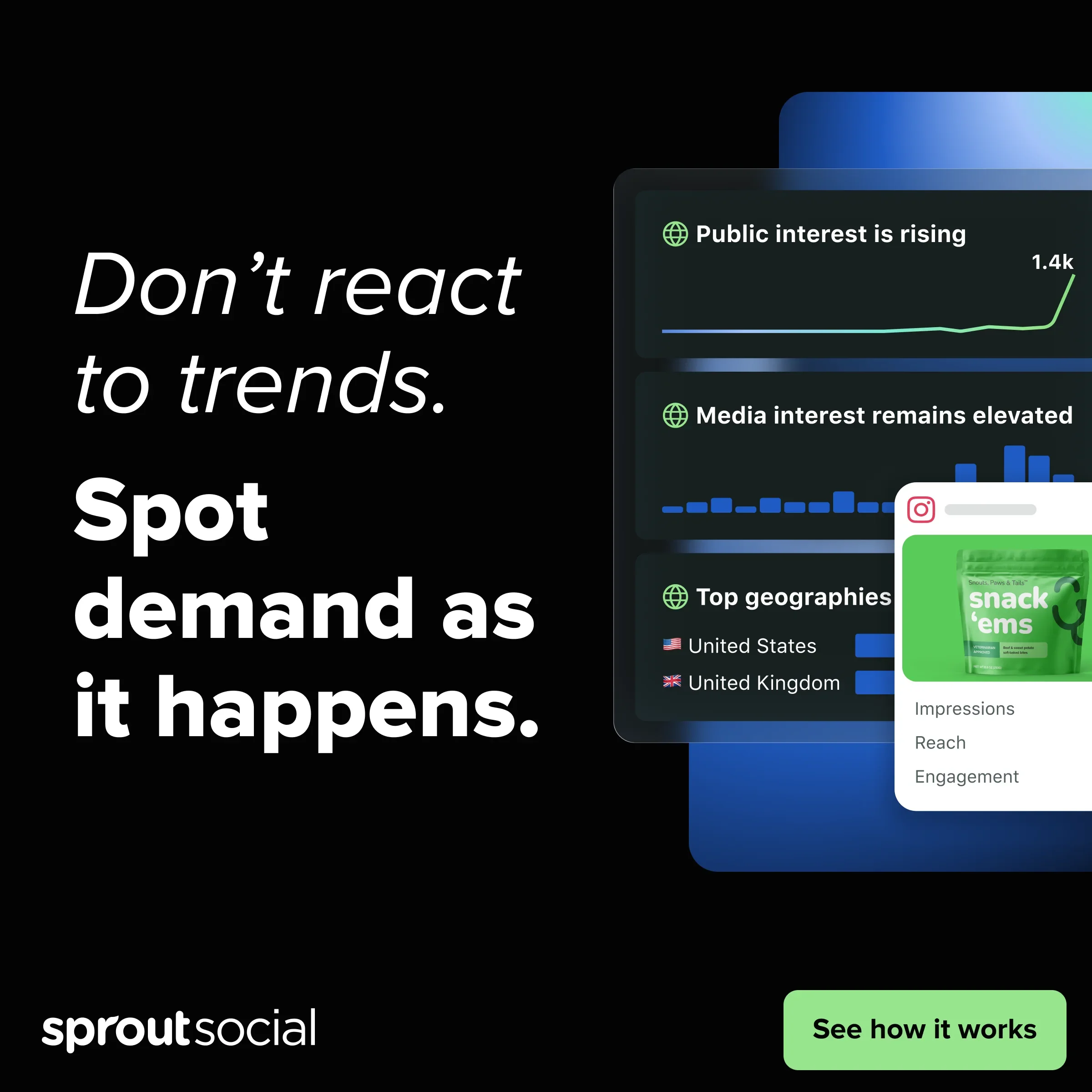
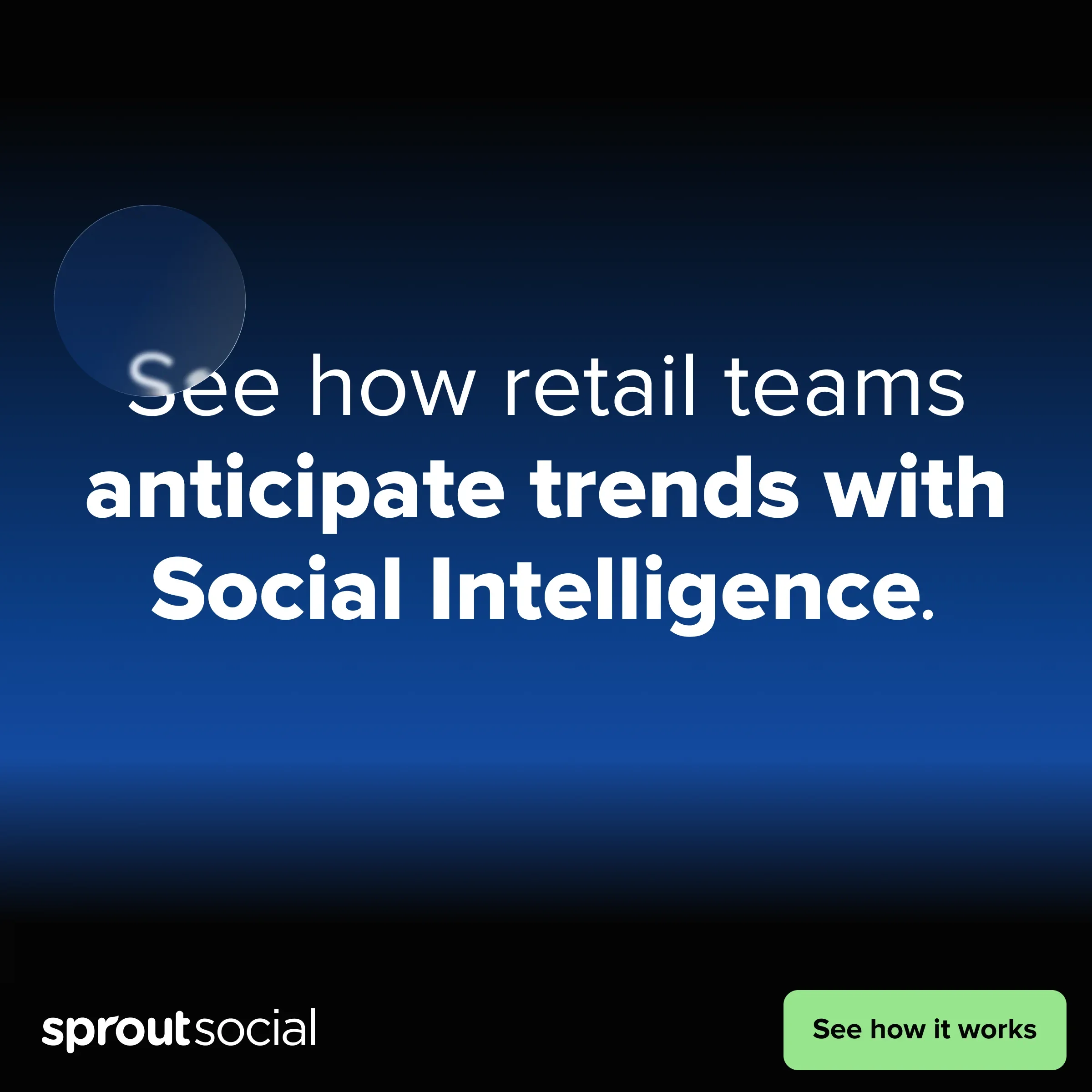
Ad Set #1
This direction leaned into an illustration-and-type approach that Sprout had used successfully in product storytelling before. Rather than showing the product literally, the creative used more conceptual compositions and expressive typography to build a narrative around retail challenges and the role Social Intelligence could play in solving them.
Result: The set drove 58–62% more clicks than expected in comparison to average of previously run ads.
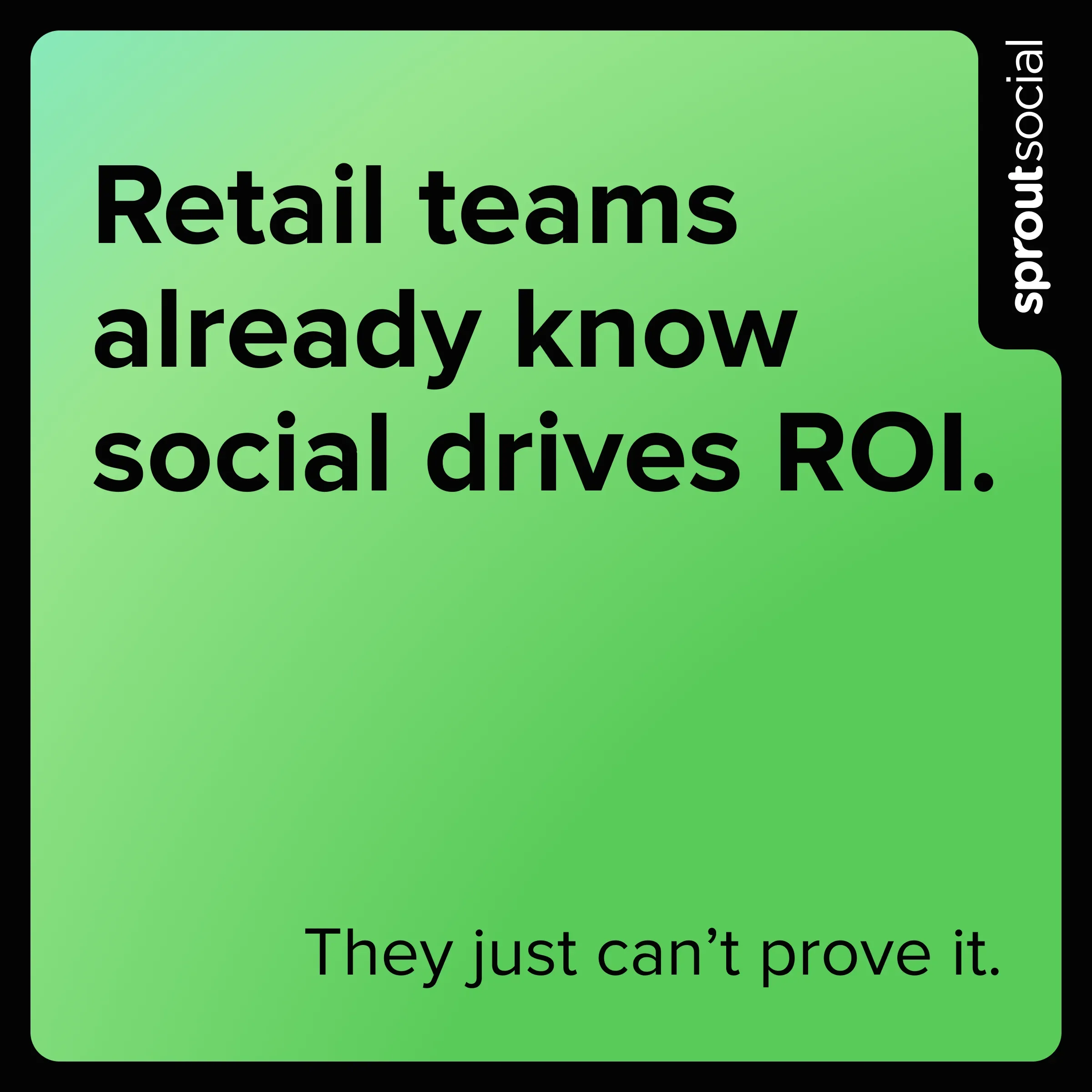
Ad Set #2
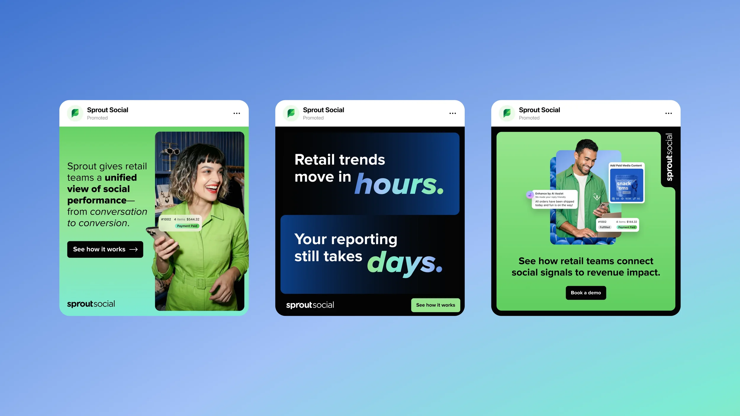
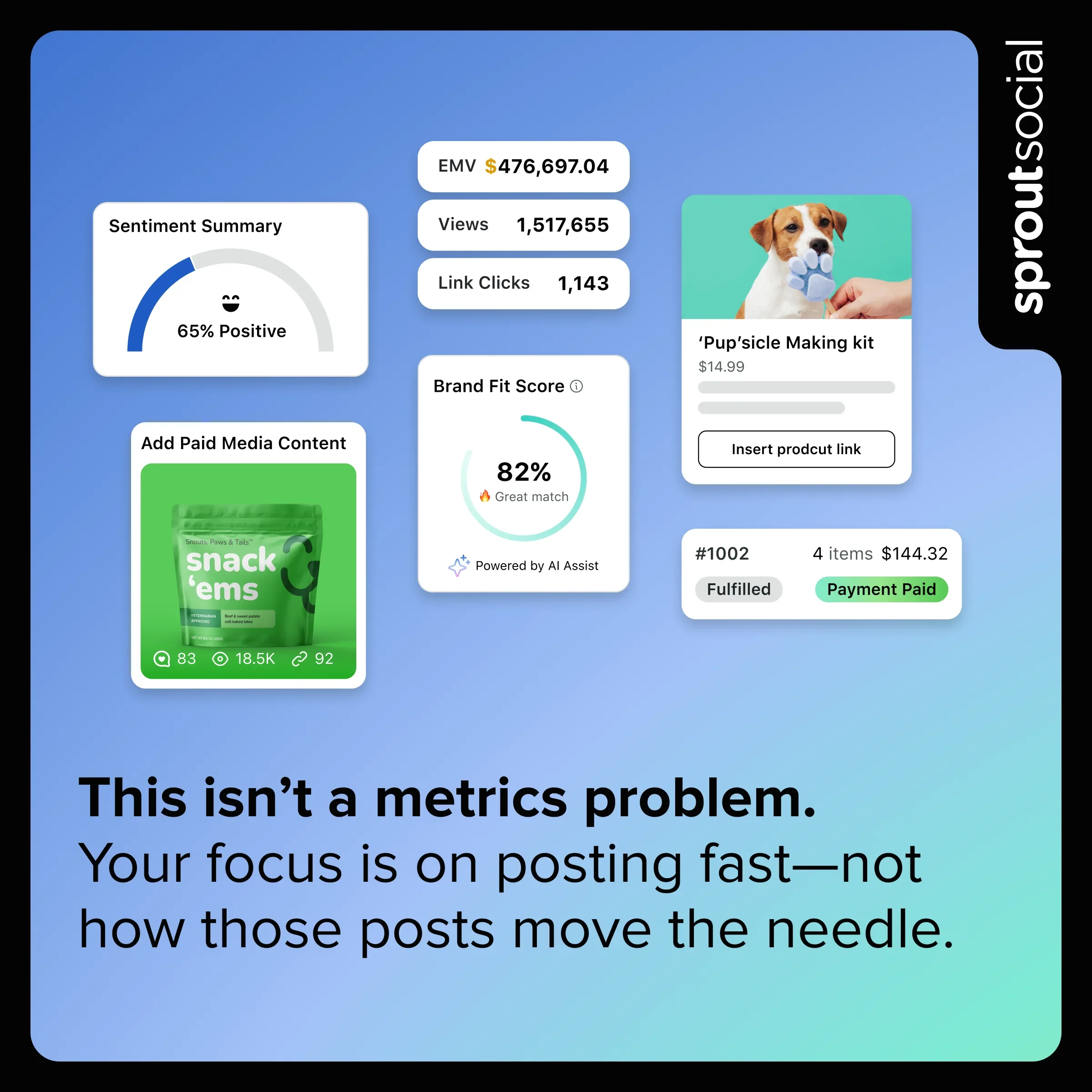
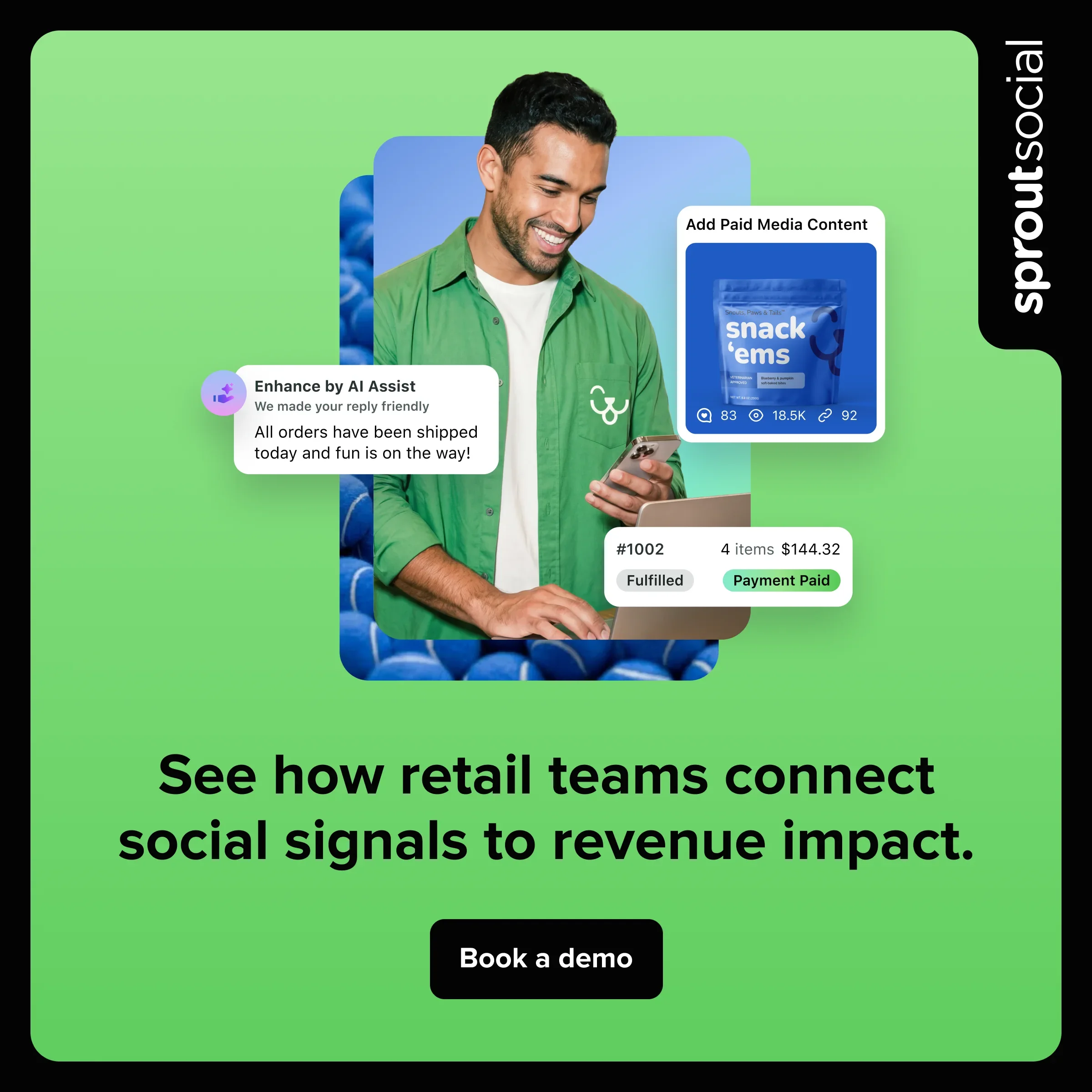
This ad set stayed closest to Sprout’s established visual language, using familiar product UI snippets and collage-style compositions that mirrored the experience users would encounter on the website. The intent was to test whether a more recognizable, product-forward expression could create continuity from ad to landing page while still driving strong performance.
Result: This creative significantly outperformed typical click benchmarks with 169–388% more clicks than expected.

Ad Set #3
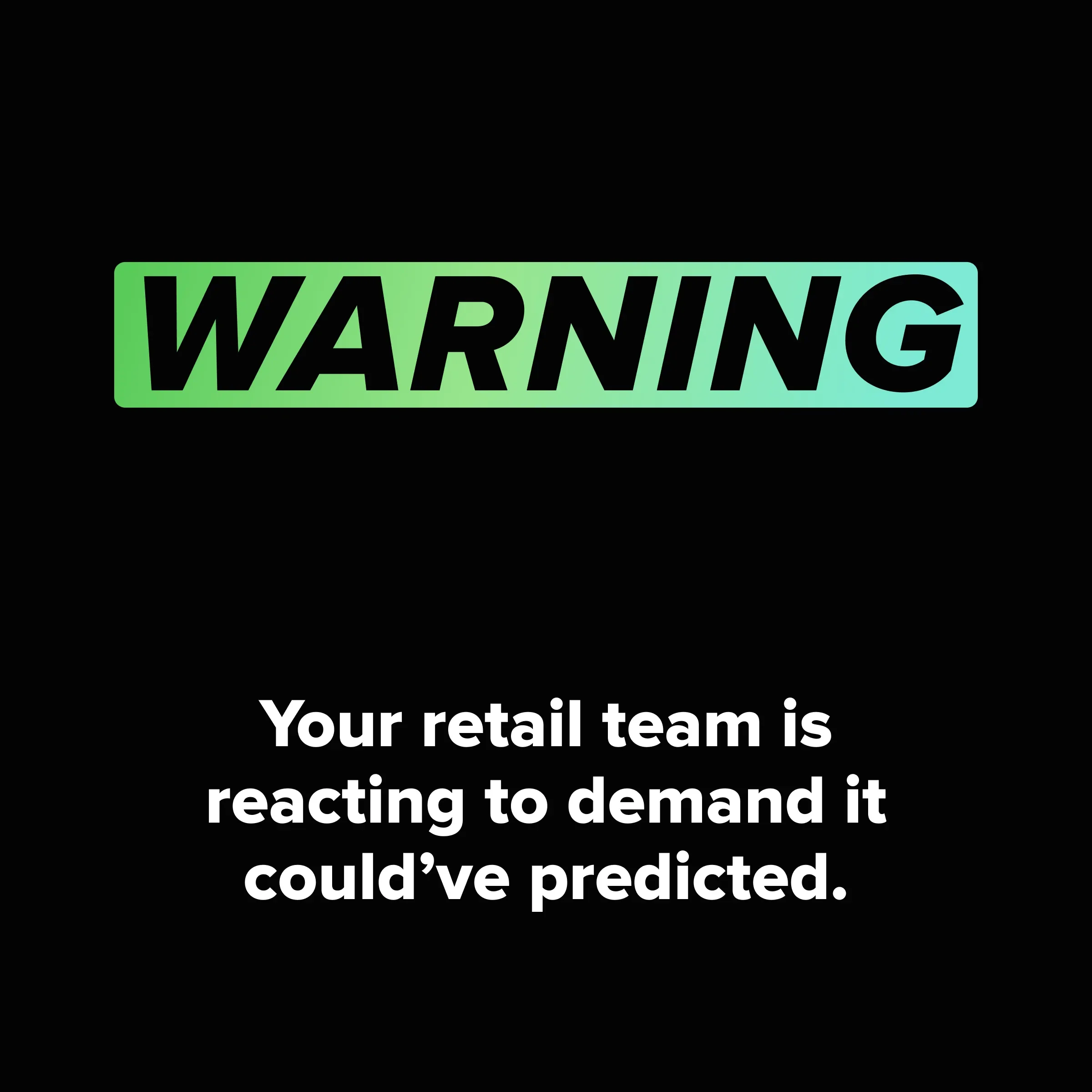
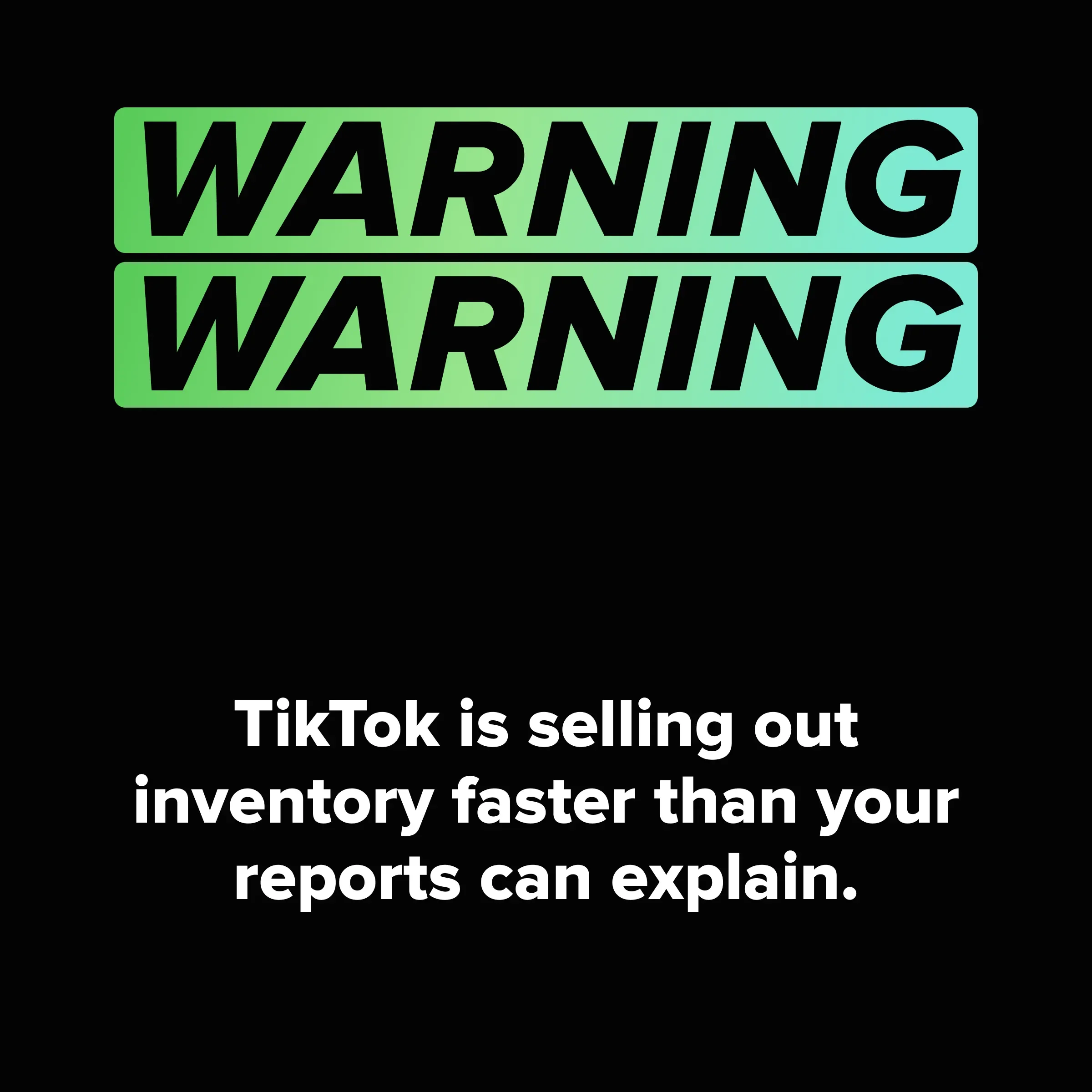
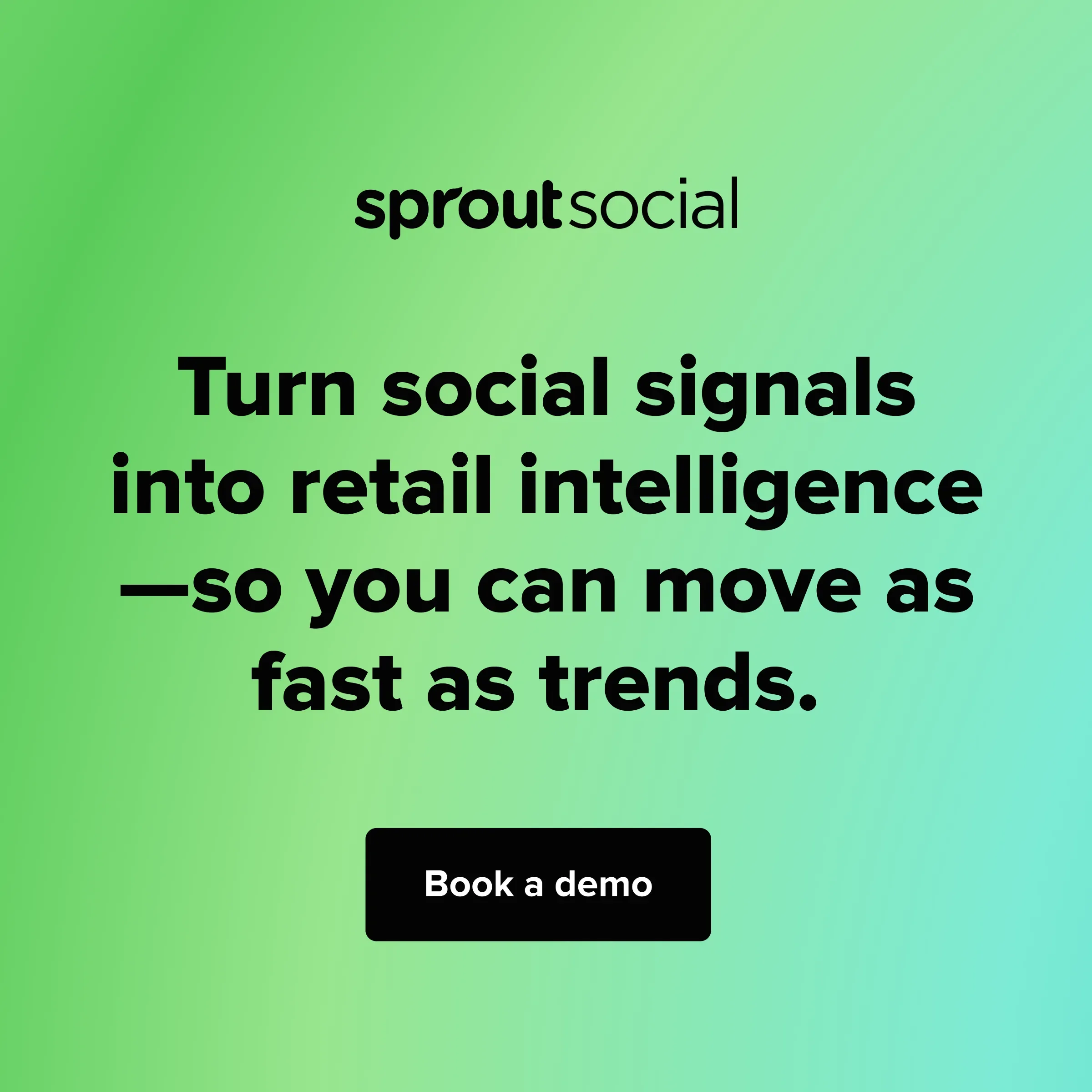
The warning-label motif had performed well in previous paid tests, even though the creative team felt the original execution did not represent the brand particularly well. For this iteration, I kept the underlying concept but evolved the visual treatment, using more stylized warning typography and established brand patterns instead of relying on generic text and warning symbol tropes.
Result: This became the strongest-performing ad set, driving 259–497% more clicks than expected.
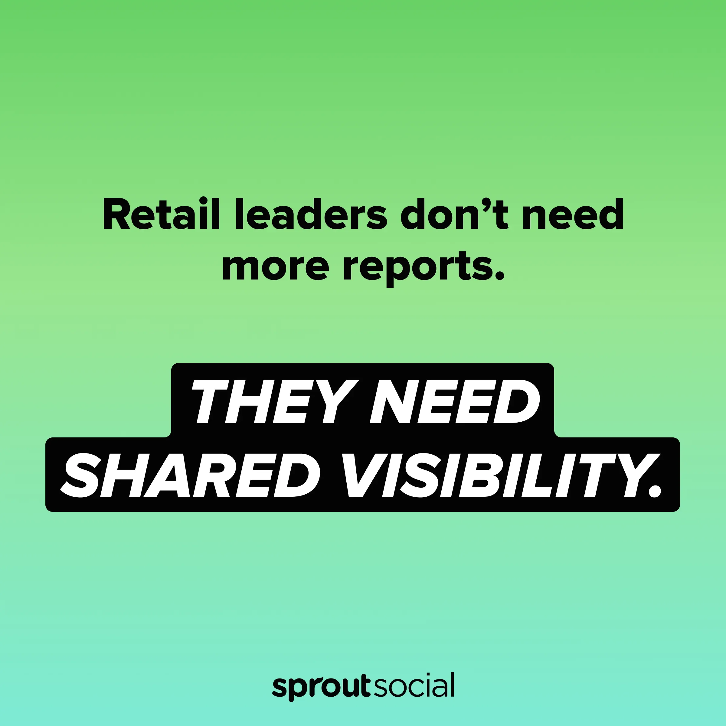
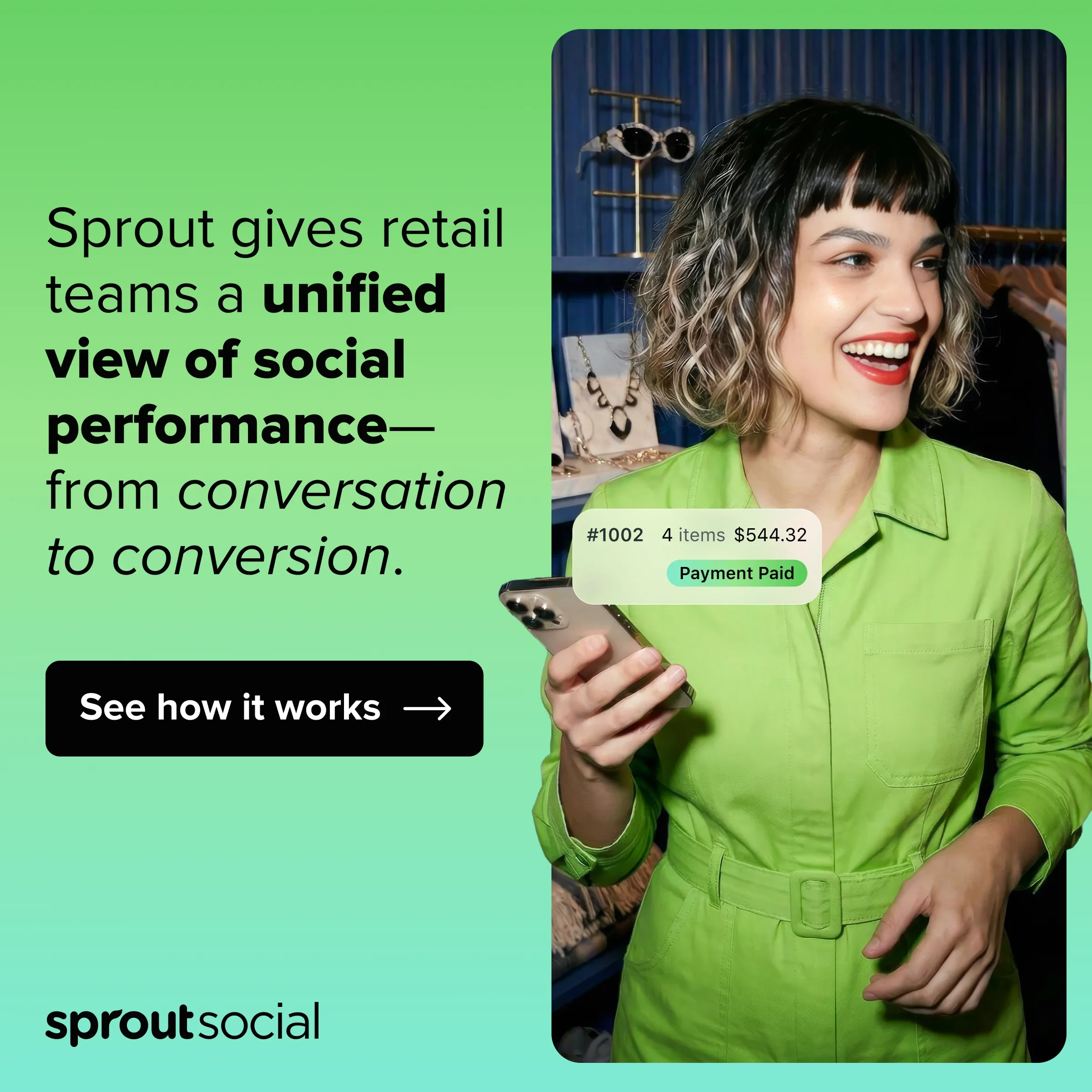
Ad Set #4
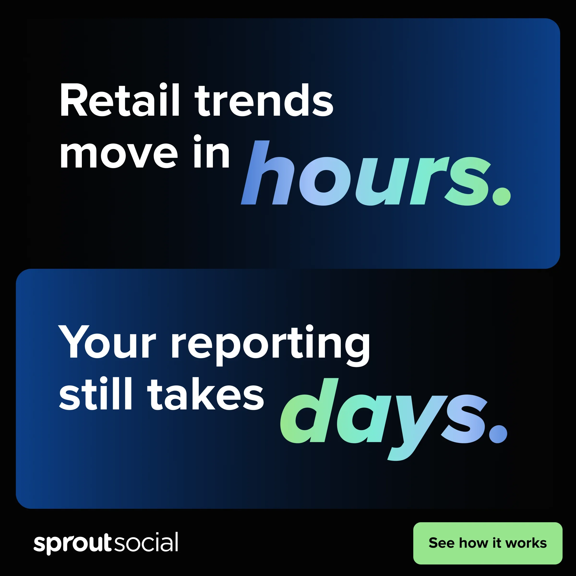
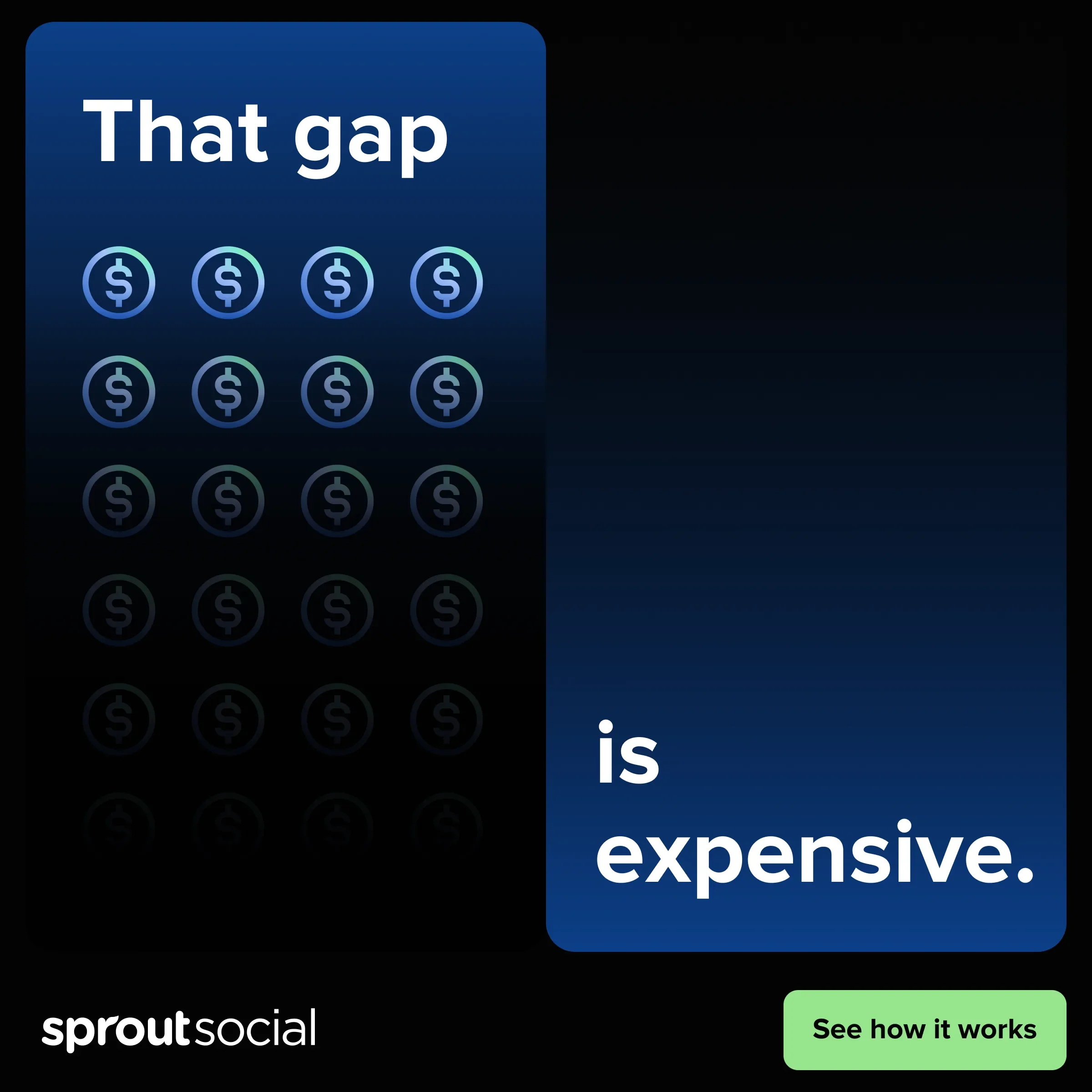
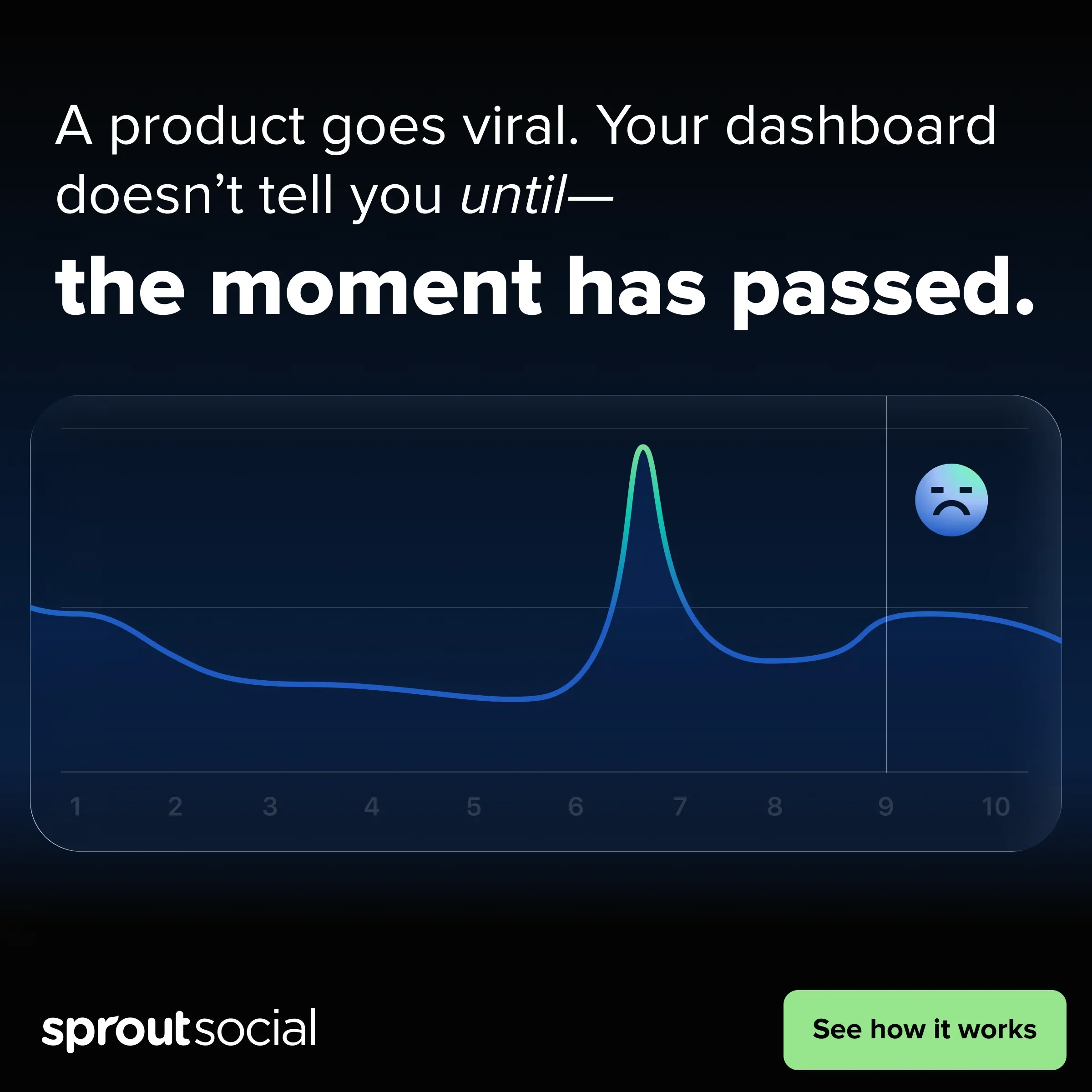
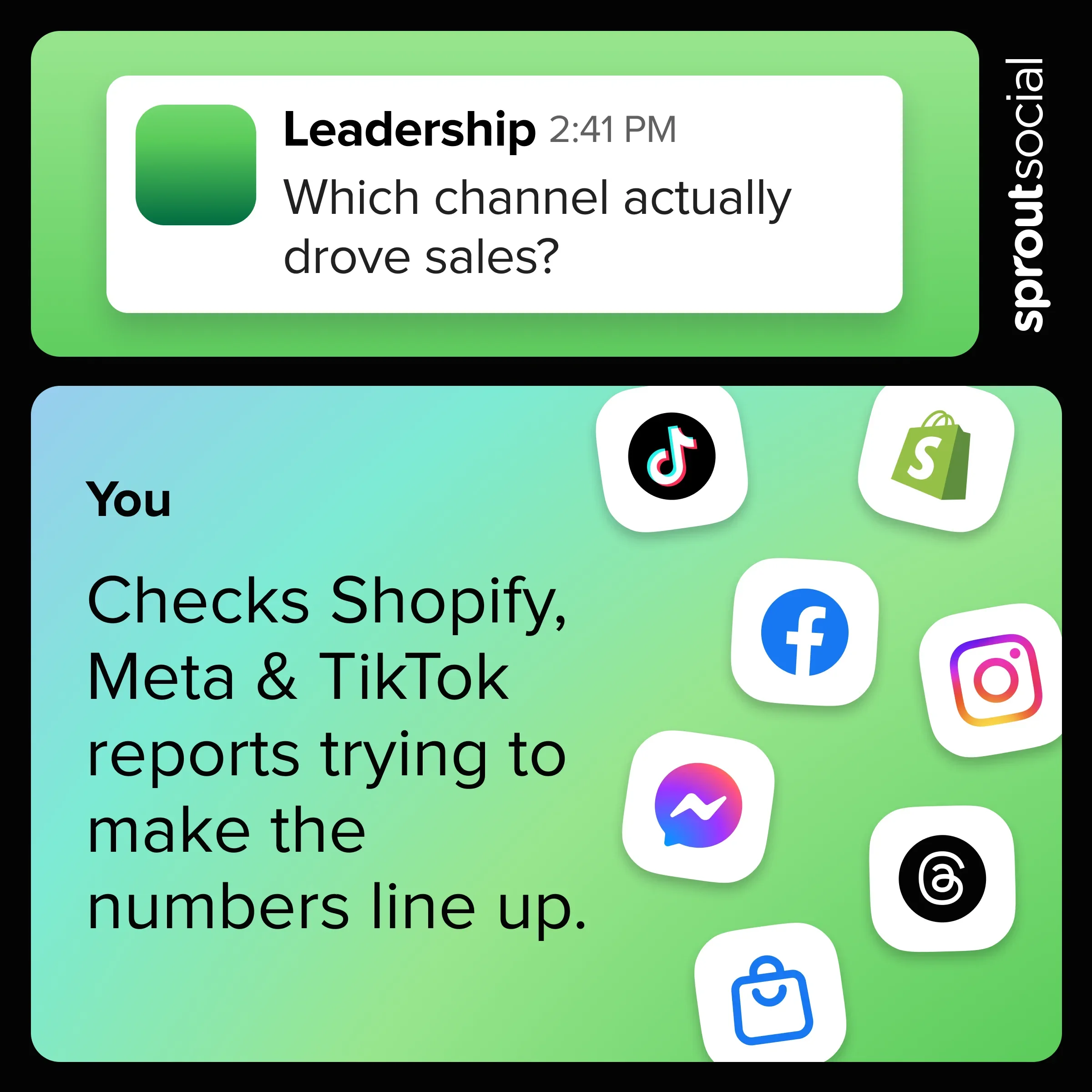
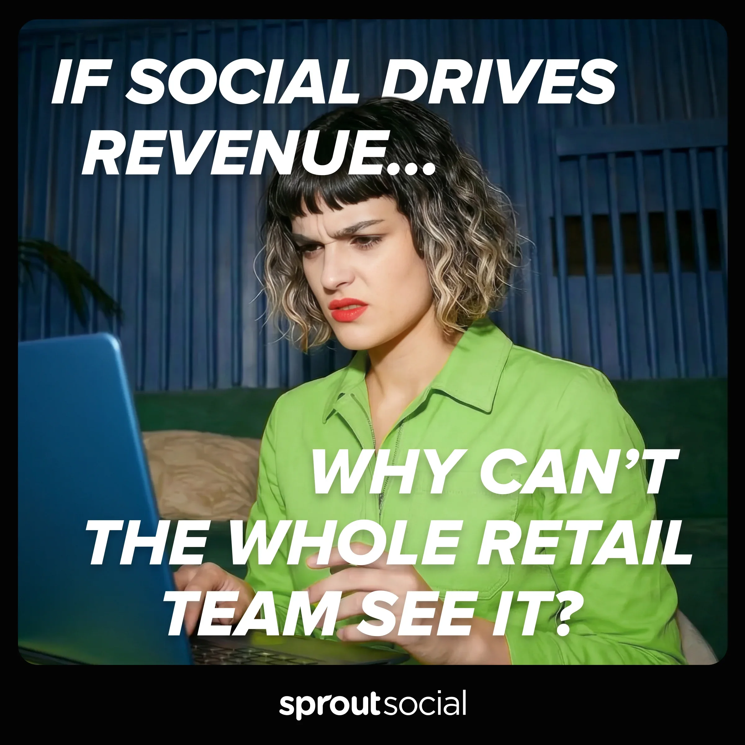
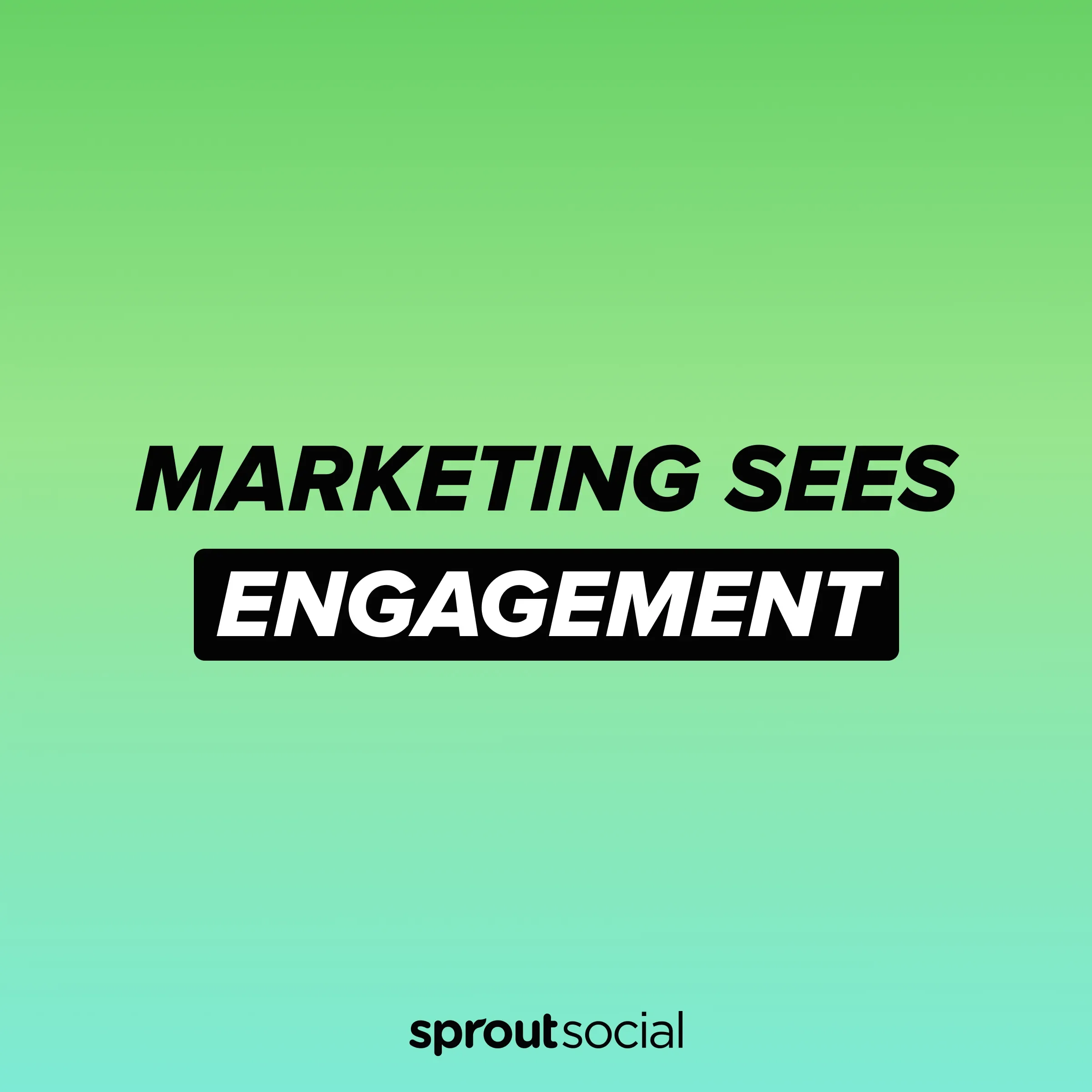
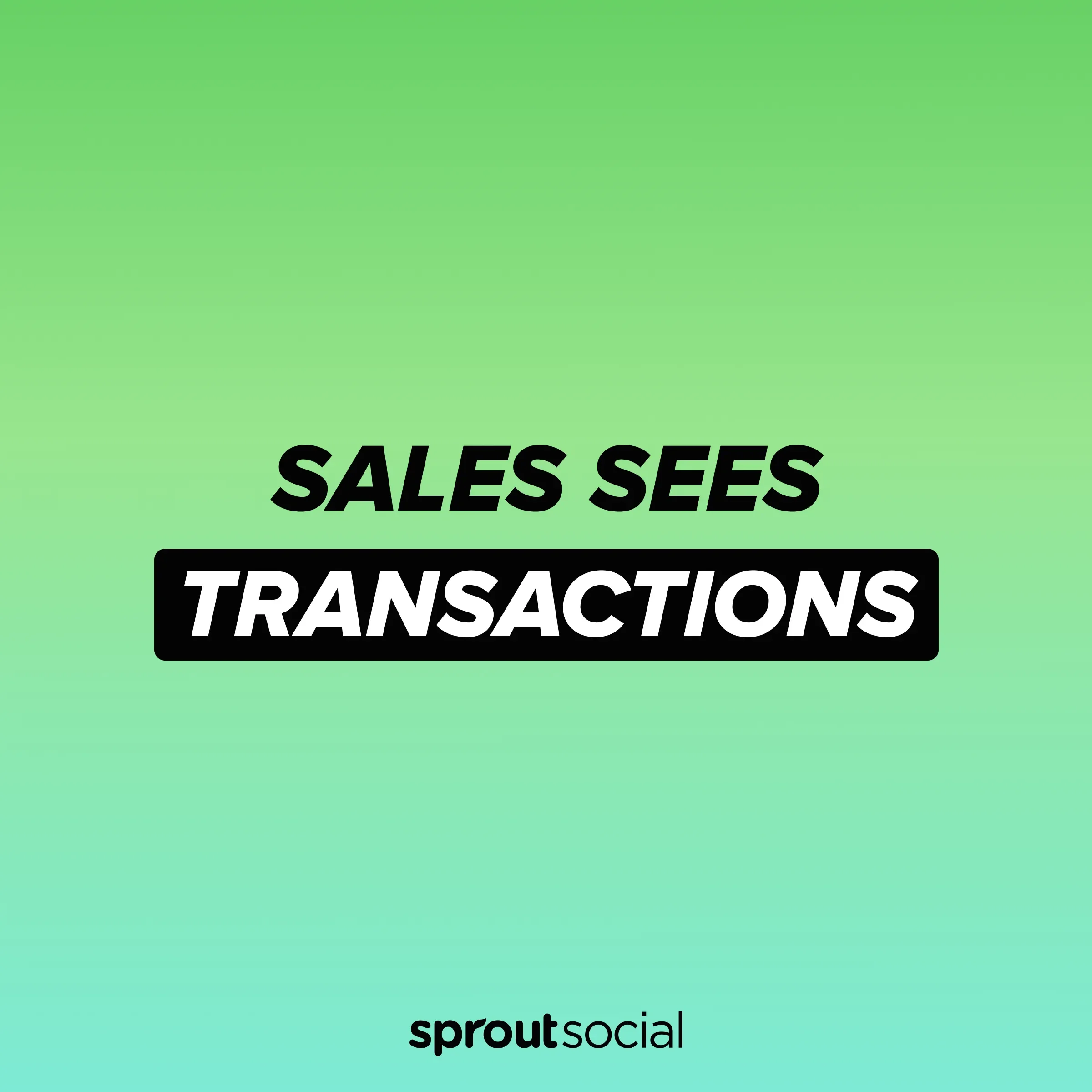
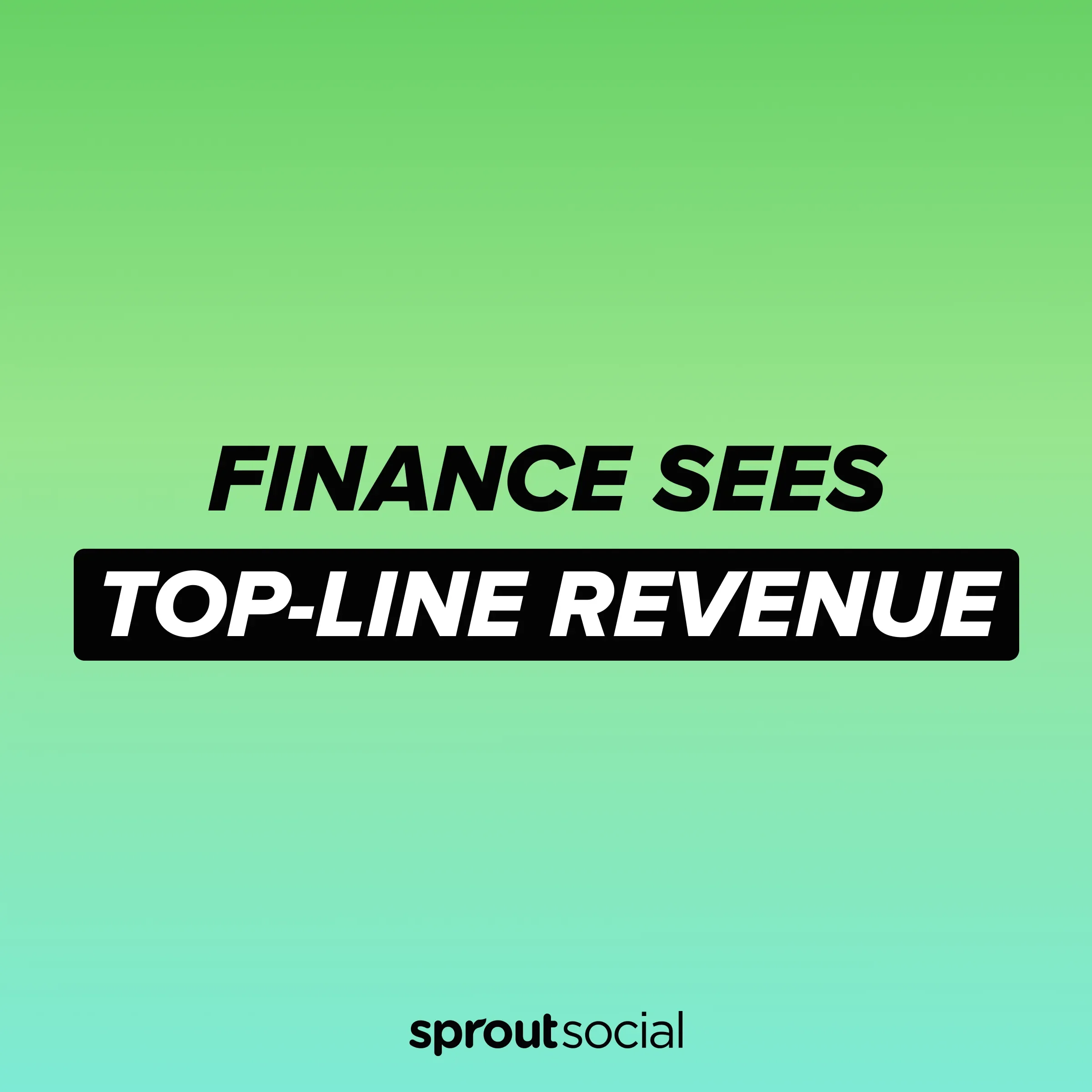
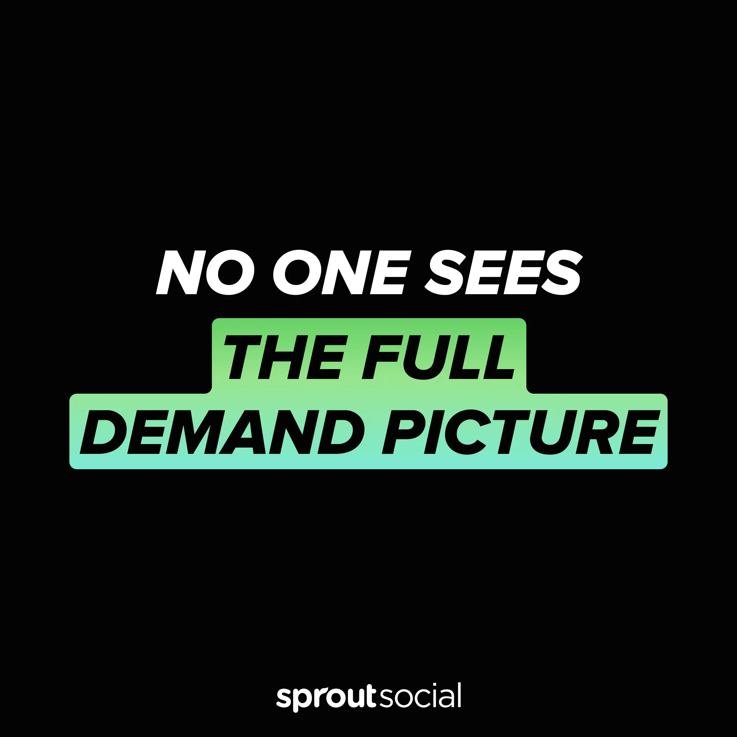
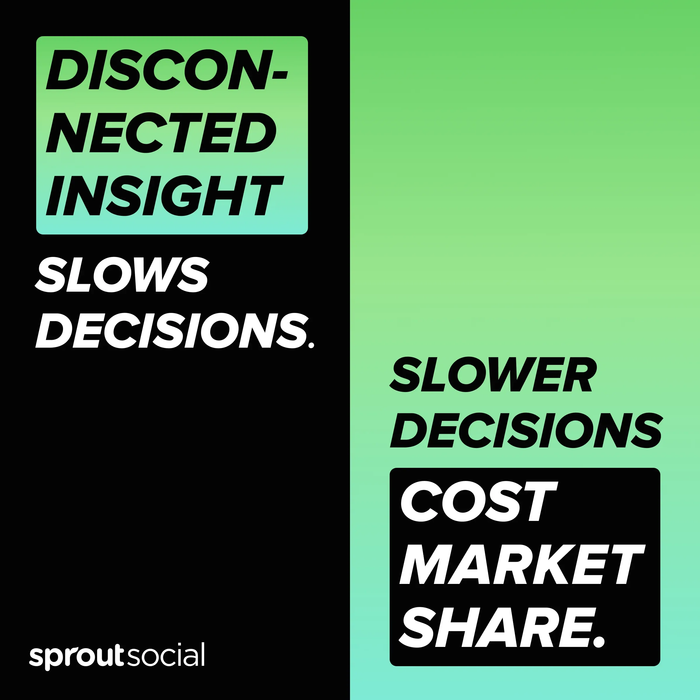
This eight-slide narrative was the most complex concept to build within the production timeline, so I deliberately simplified the visual system. Bold, expressive typography carried the story across the middle slides, while AI-generated photography bookended the sequence. Keeping each frame visually restrained was intended to encourage continued swiping while also testing how a simpler, more narrative-driven approach compared with the more product- and graphic-heavy designs.
Result: The set drove 56–59% fewer clicks than expected, making it the clearest underperformer and providing a useful contrast against the more direct and visually distinctive approaches.