Chapters Executive
Event Series
2025
Role
Creative Strategy
Art Direction
Visual Identity
AI Image Direction & Generation
Web Design
Core Creative Team
Arden Wilson (Design)
Chapters is a curated executive event series designed for enterprise marketing leaders looking for more than another industry panel or product pitch. The experience was built around intimate, high-design gatherings that brought together social intelligence, creative thinking and peer exchange in a format that felt more cultural than corporate.
I led the creative strategy and art direction for the series, building a scalable visual system that could flex across topics, cities and formats while remaining cohesive. I also designed the registration experience, developed the AI image direction and asset library, and helped create the templates and tools marketing needed to carry the series forward with limited creative support.
Decode / Deconstruct: Designing from fragments to focus
The Chapters visual system was built around a simple idea: clarity emerging from complexity. Through pixelation, obstruction and recomposition, the identity reflects the fragmented nature of modern marketing and the perspective the experience is designed to create. Across the customer journey, the system could shift from more obscured, disruptive compositions in promotion to more open and resolved expressions during and after the event.
Logo
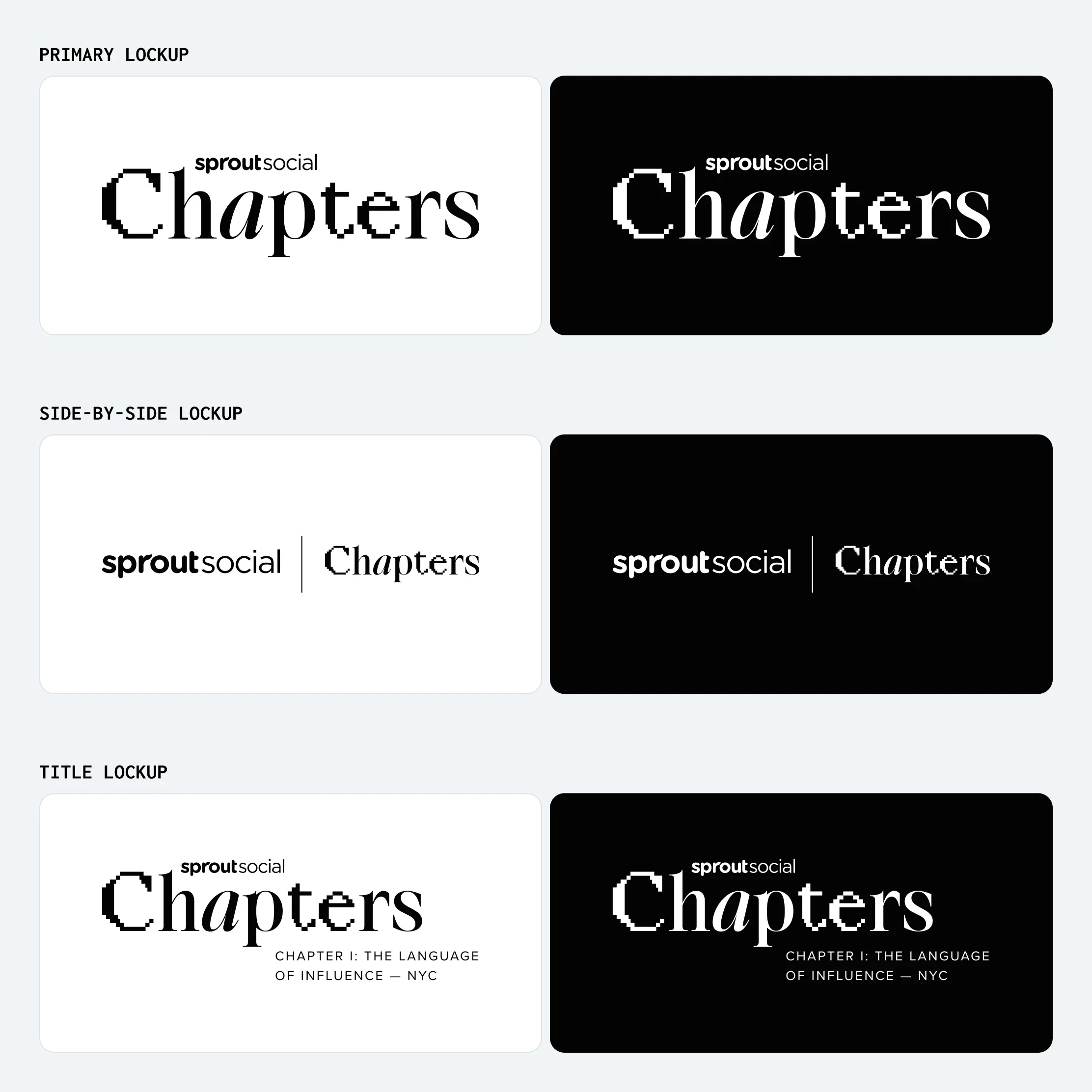
The Chapters logo bridges digital disruption with editorial elegance. Pixelated bitmap forms are paired with a refined serif to capture the central tension of the series: insight revealed through complexity. The mark introduces the Decode / Deconstruct concept immediately while remaining flexible enough to work across topics, cities and formats.
Color
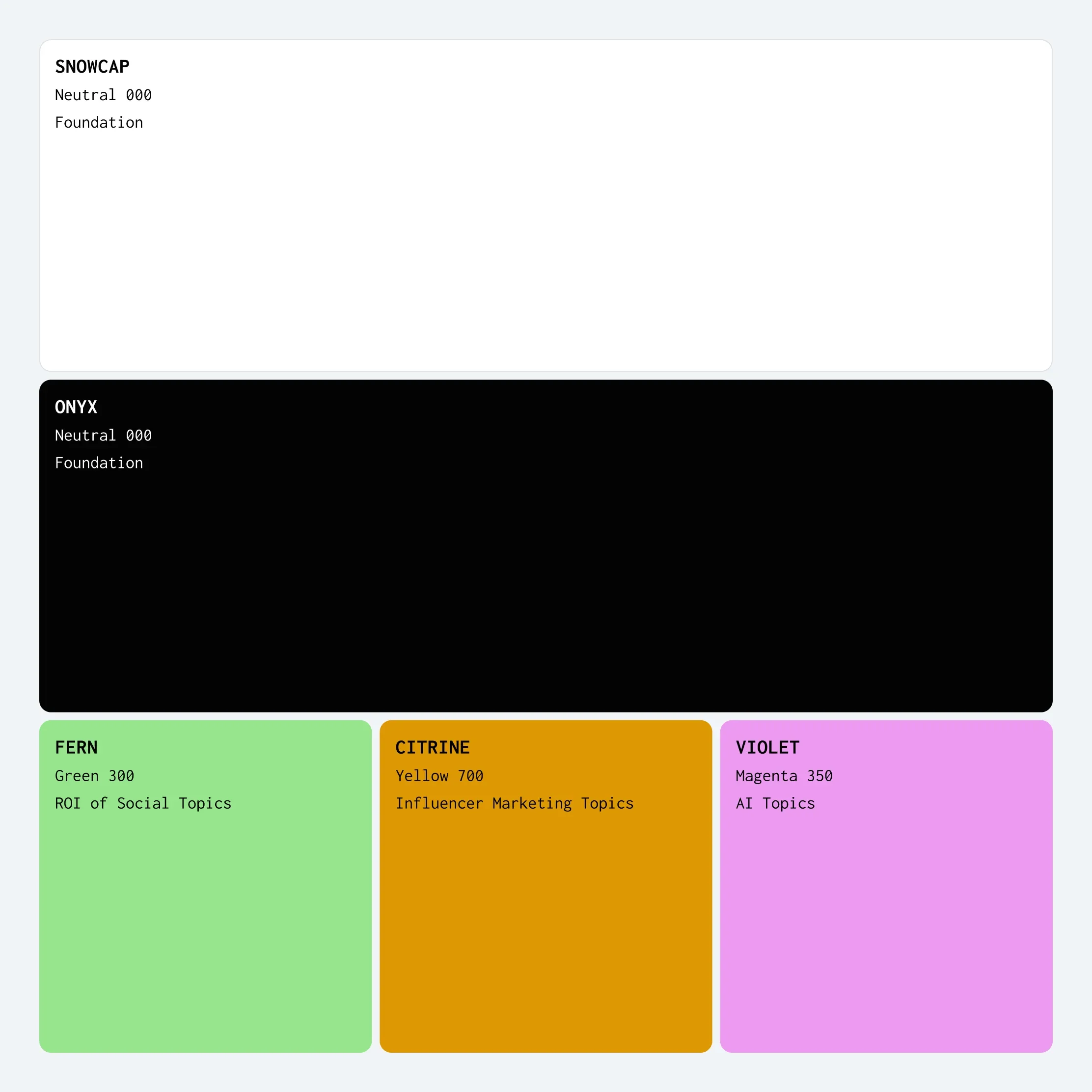
Chapters’ color system is primarily monochrome, with intentional moments of color used to disrupt and punctuate. Snowcap and Onyx form the foundation, while each chapter or topic introduces a single accent color drawn from Sprout’s existing brand palette. This creates distinction between experiences without separating Chapters from the broader Sprout brand.
Grid
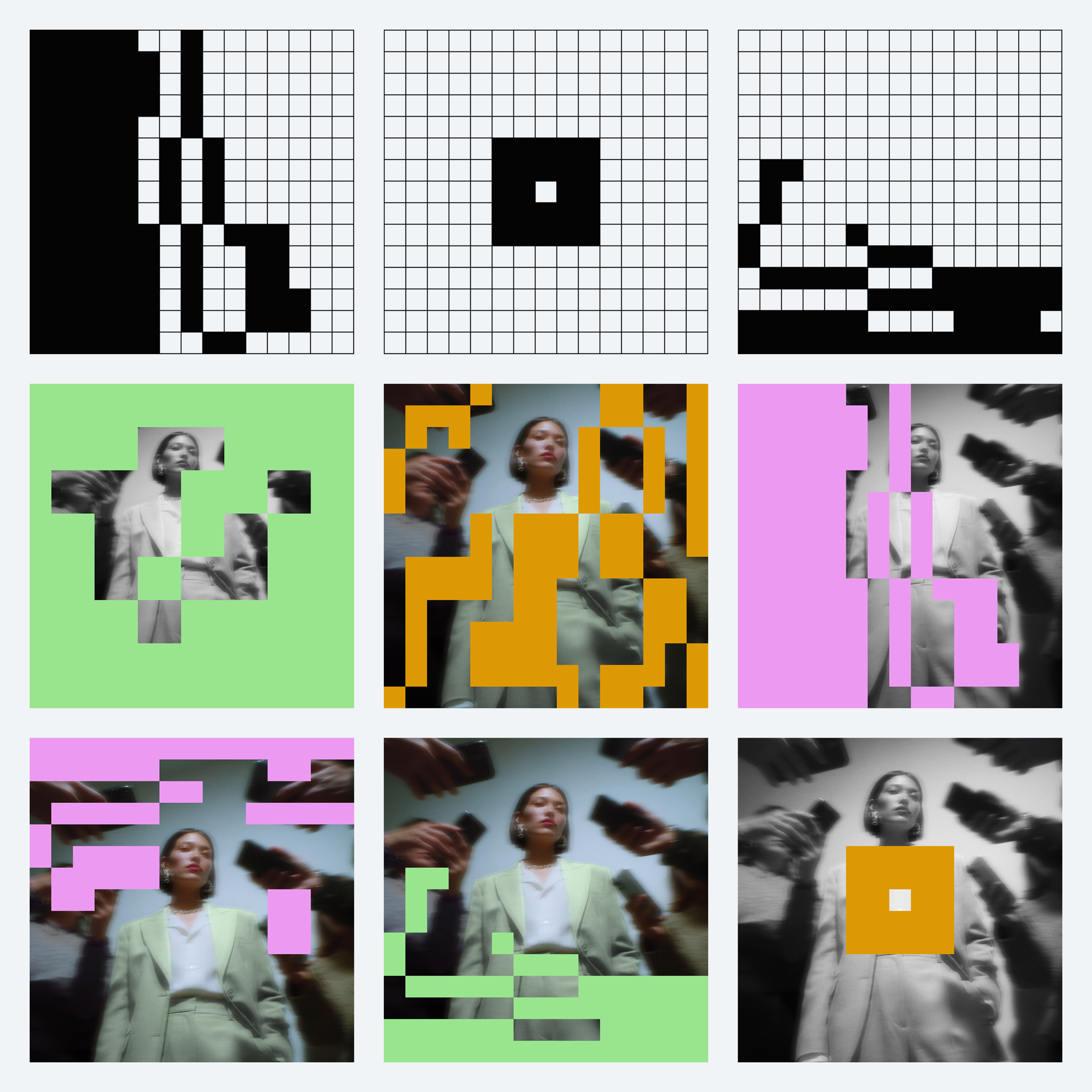
The pixel grid is the core visual device in the Chapters system. Built from a modular structure, it can shift from dense and obstructive to open and minimal, creating a visual language of concealment and reveal that reinforces the central idea of insight emerging from complexity.
Used across photography, typography and backgrounds, the pattern introduces tension, interruption and movement while remaining flexible enough to scale across formats. Its density also changes across the event journey, with more fragmented compositions used in promotion and more resolved expressions appearing during and after the event.
Photography
Photography was used to balance the more abstract parts of the Chapters identity with a sense of place, atmosphere and human connection. The direction combined editorial AI imagery, city-focused stock photography, and intimate venue photography to create a visual language that felt elevated, culturally aware and intentionally removed from typical B2B stock.
Across the system, imagery could move between obscured and revealed, abstract and grounded, helping reinforce the broader Decode / Deconstruct narrative while giving each Chapter its own sense of mood and location.
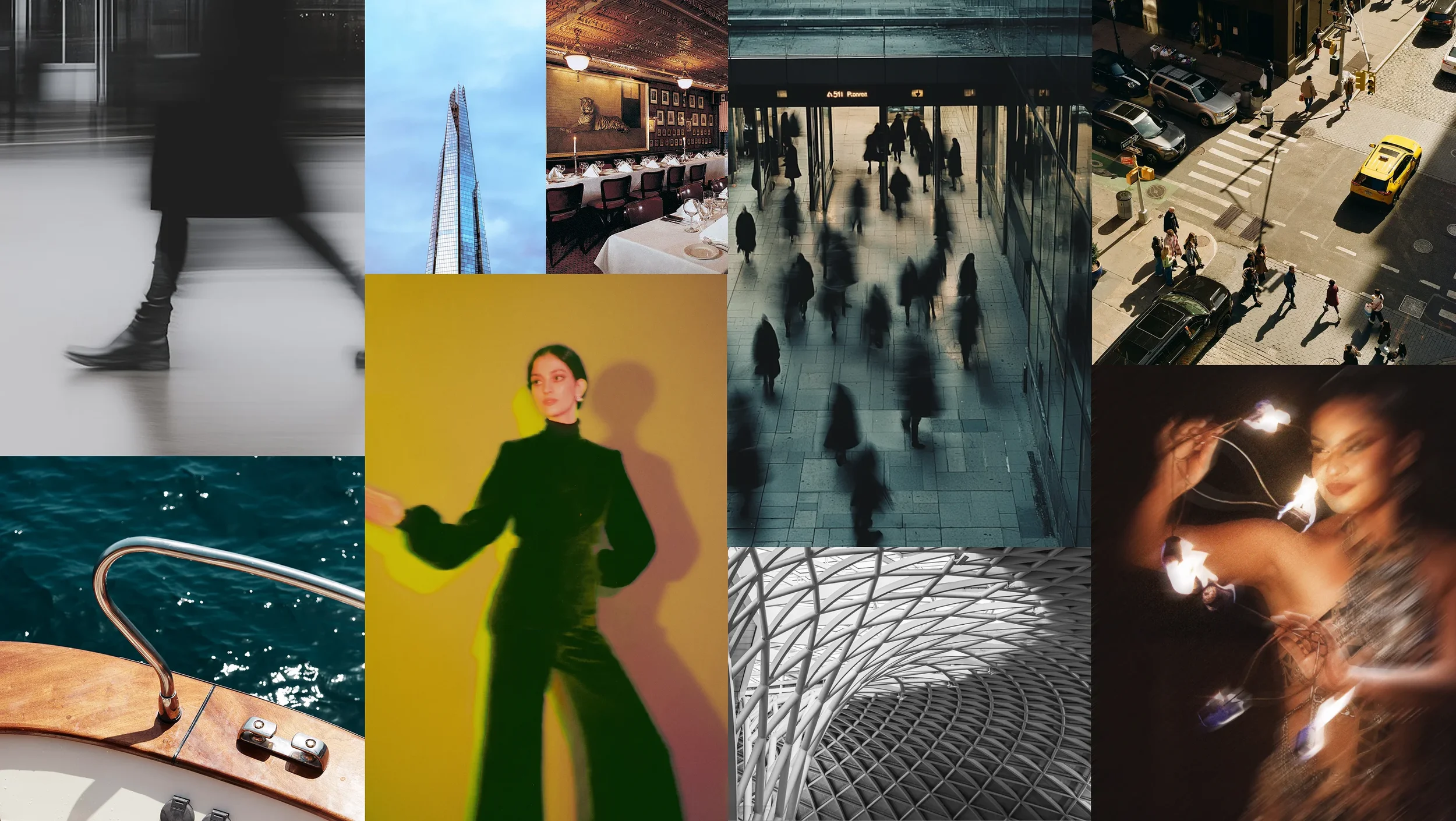
Image mix includes stock, AI-generated and venue-provided photography.
Building the AI image library
The AI imagery was designed to feel more like bespoke editorial photography than traditional B2B creative. Each image set was developed around one of the core Chapters themes and colorways: ROI of Social in shades of green, influencer marketing in a yellow palette, and AI in shades of magenta/purple. The goal was to create a distinct visual world for each topic while keeping the overall image language cohesive.
My process combined image research and style references from Lummi with generation in Midjourney, Nano Banana and ChatGPT. From there, I art directed the various AI tools and their outputs through repeated rounds of refinement, adjusting composition, color, subject details and consistency before completing final retouching in Photoshop.















Designing a self-serve registration system
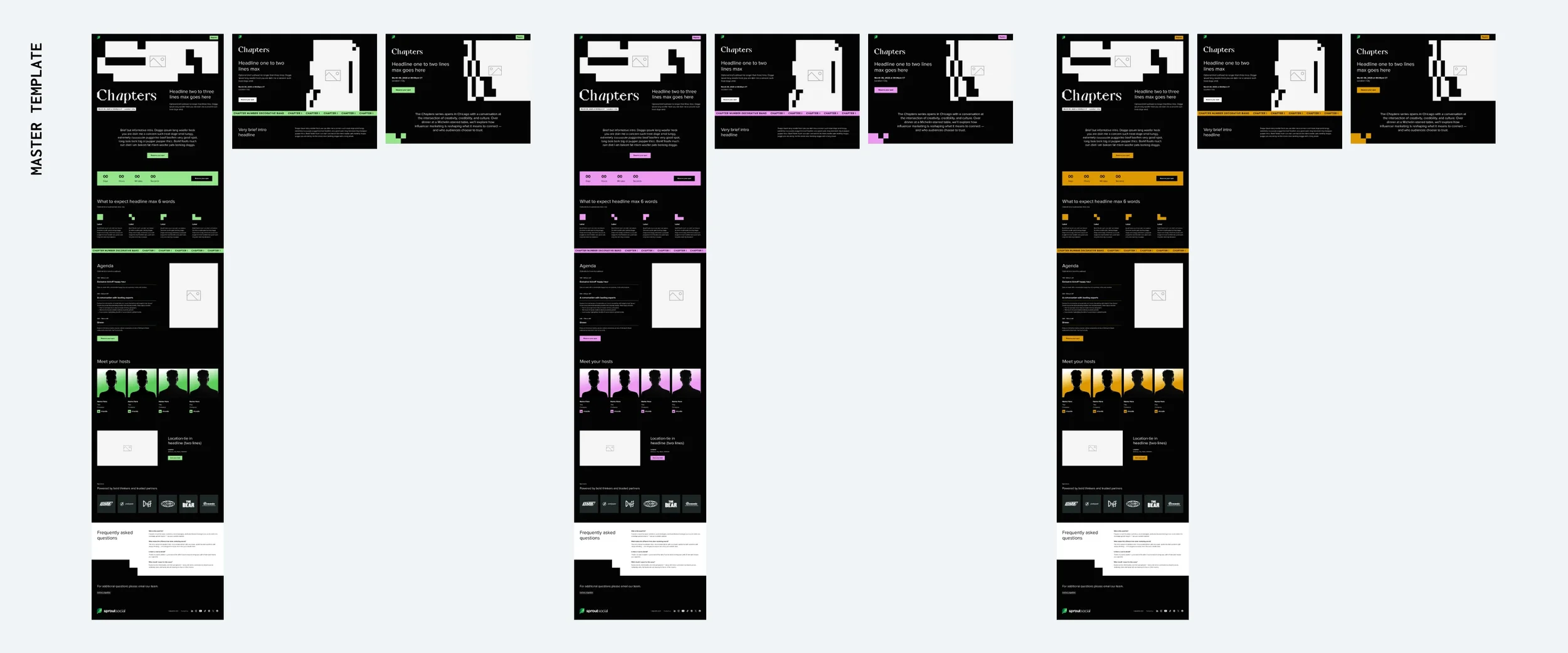
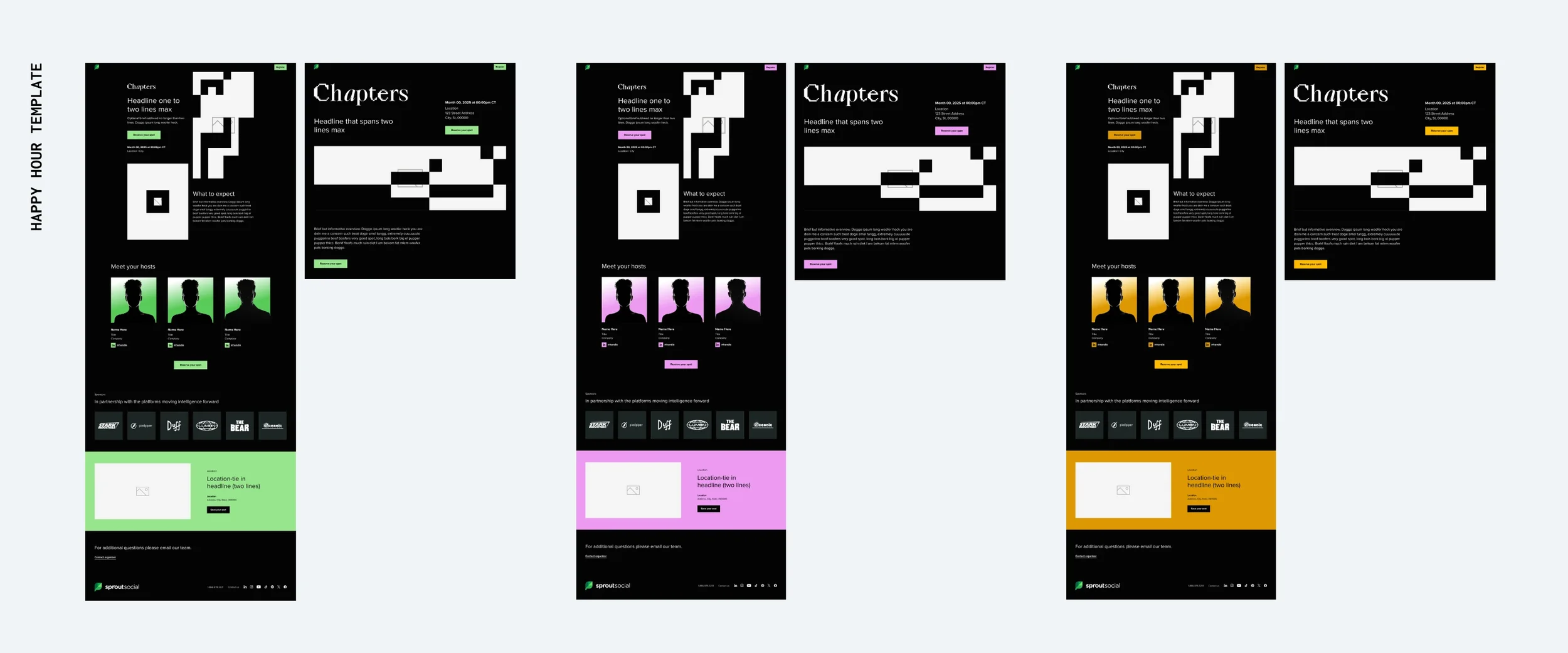
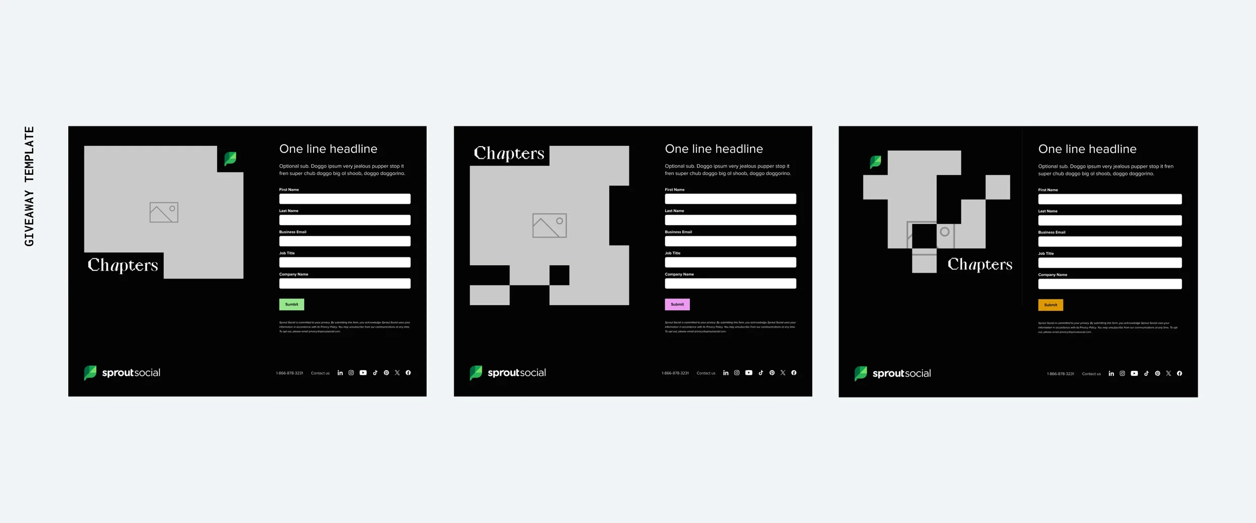
To make Chapters scalable across events, I created a flexible registration template library that marketers could manage without ongoing design support. Each template was designed in Figma, then built by me in Splash across all three event colorways so teams could launch pages that felt distinct while still staying inside the larger Chapters system.
The master template was built to flex with different content needs, allowing sections to be added, removed or reordered without breaking the experience. I also created alternate header and intro treatments to give marketers more visual variety between events. A streamlined happy hour template supported smaller, detail-focused gatherings, while a dedicated giveaway template covered incentive-based registration needs.
Together, the templates gave the event team a practical, plug-and-play toolkit that could support a wide range of experiences without requiring a bespoke page for every activation.
The full event journey
The Chapters system was built to carry consistently across the entire attendee experience, from the first promotional touchpoint through the live event and into post-event follow-up. I designed a portion of the collateral directly and art directed the rest, using the visual system as a framework for both repeatable templates and more bespoke event moments.
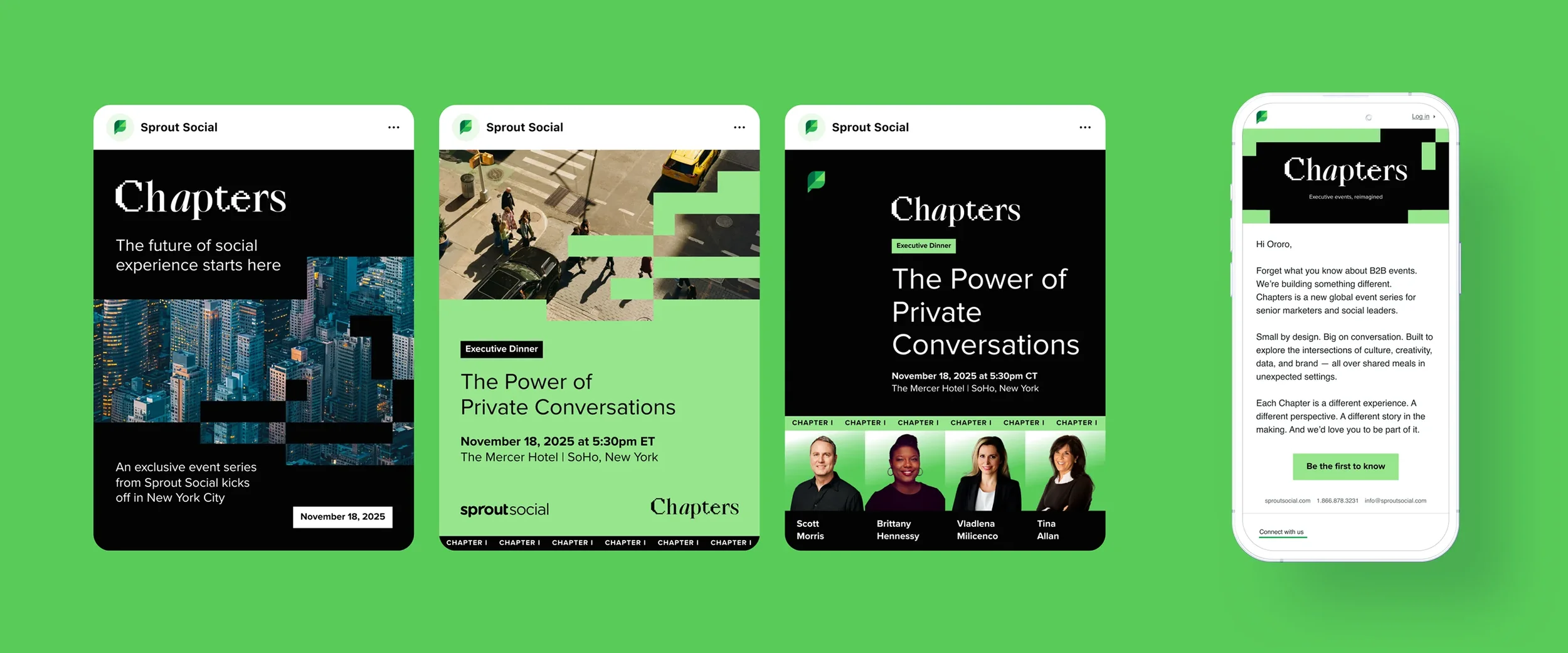
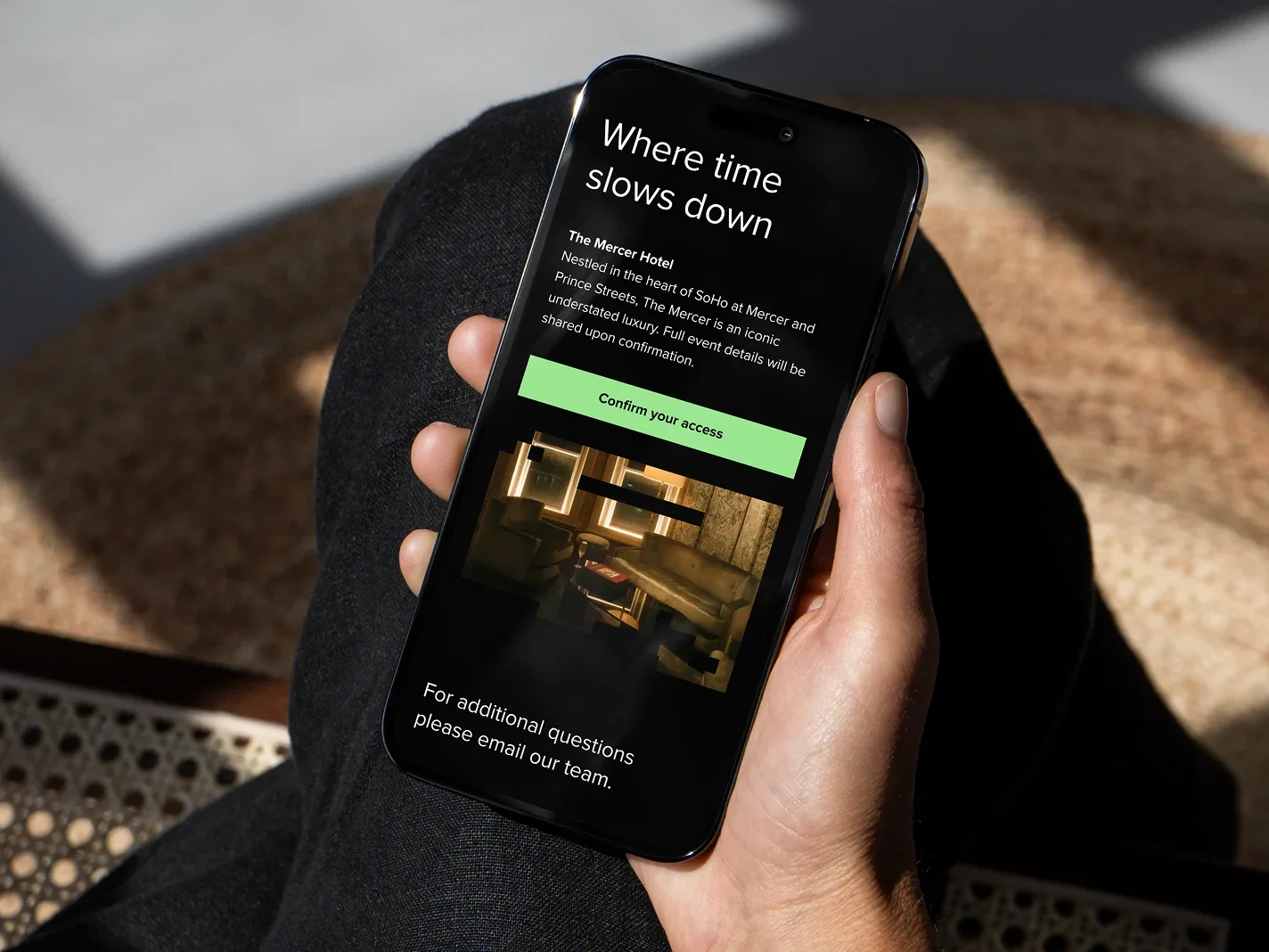
Social, email, and registration
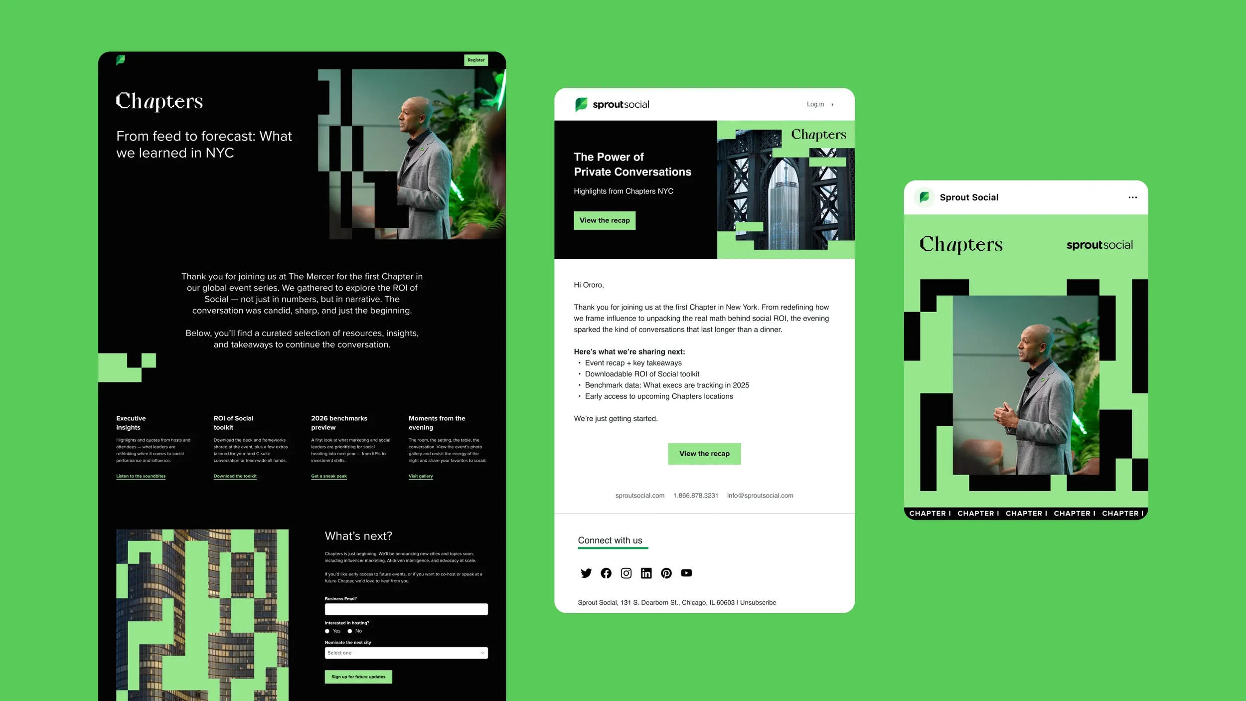
Social, email and registration materials introduced each Chapter through the same editorial visual language used throughout the larger system. Registration templates were designed to flex by topic and event type, while promotional assets gave marketers a consistent way to build anticipation without requiring new creative for every activation.

Live experience
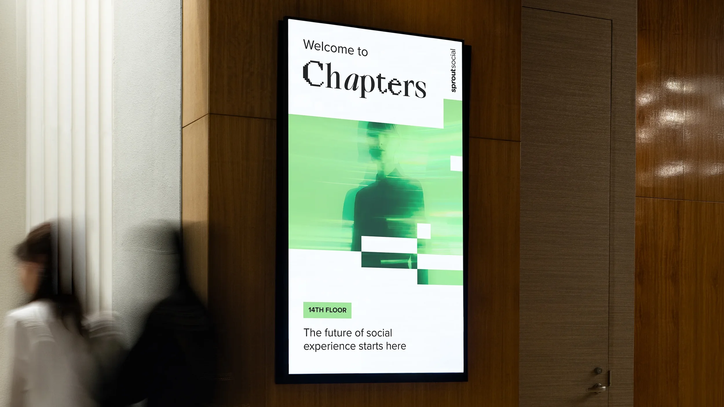
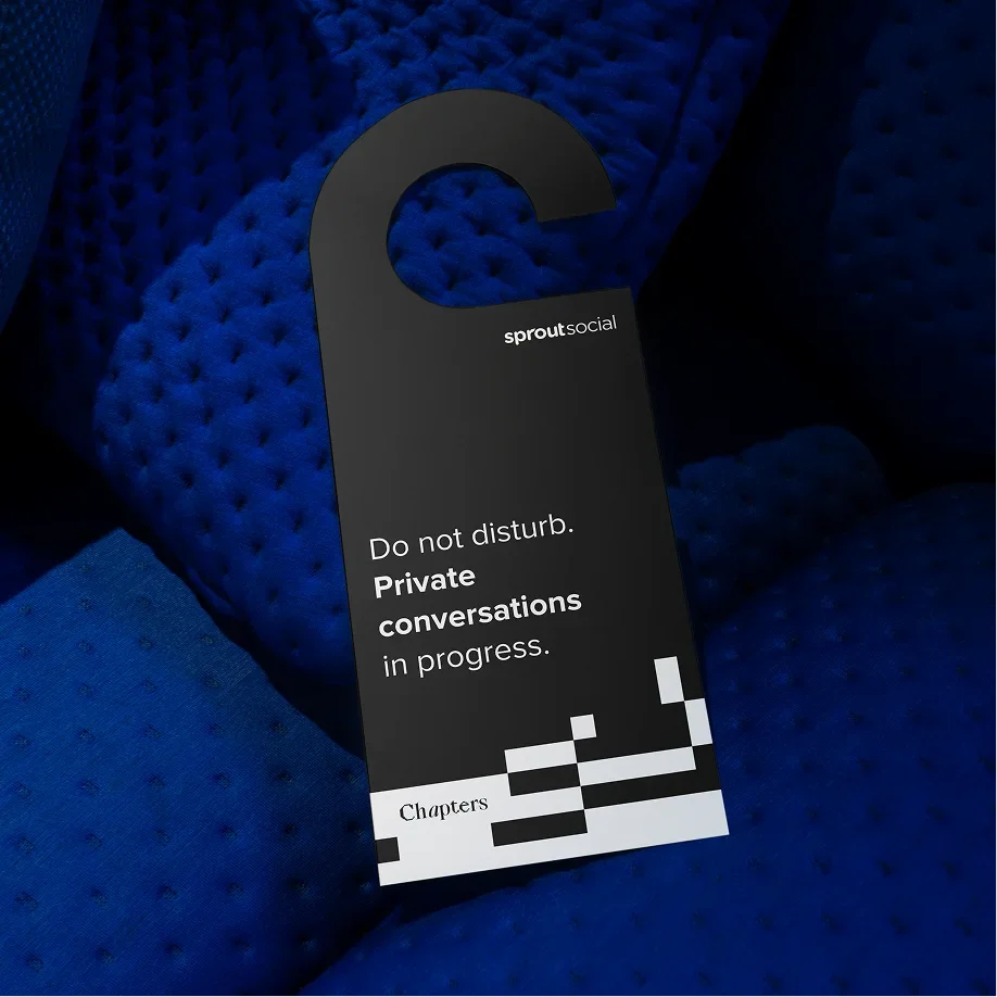
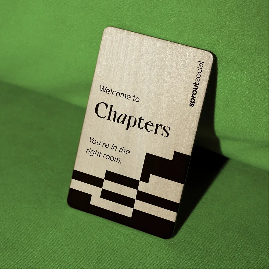
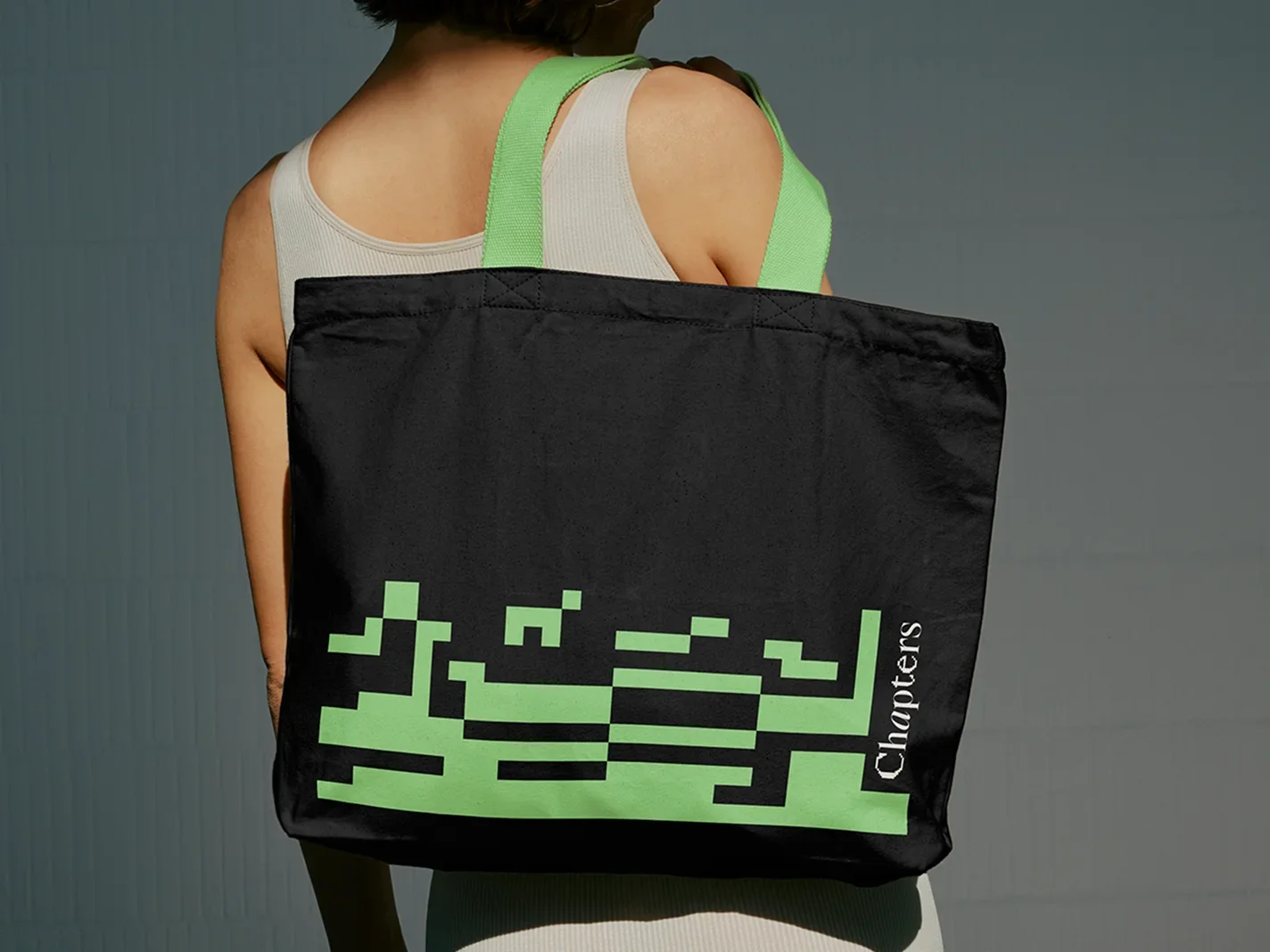
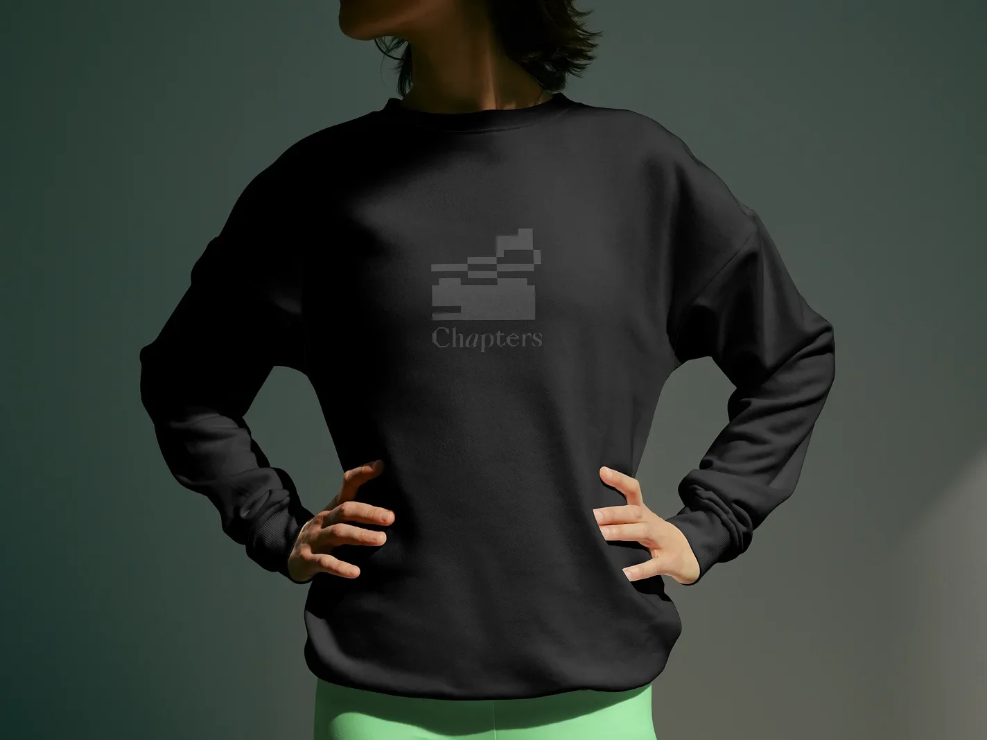
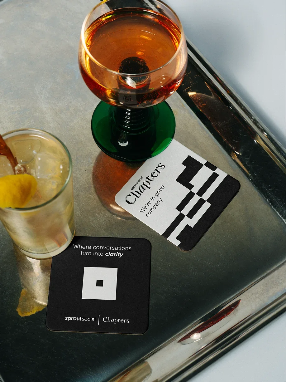
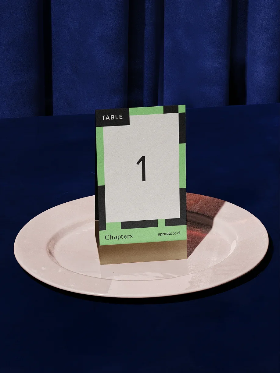
The in-person experience extended the identity into digital signage, dinner materials, swag and more tactile attendee touchpoints. Concepts ranged from branded tote bags and apparel to hotel keycards, keychains and door hangers, along with table tents, name cards and coasters designed to bring the system into smaller details throughout the event.
Some of these concepts were produced for live Chapters events, while others were developed as part of the broader toolkit to show how the system could scale into future experiences.


Post event communication
Post-event web, social and email templates were designed to carry the same visual language beyond the room, giving teams a way to recap the experience, continue the conversation and reuse event content without losing the identity established before and during the event.